Are you a User Experience professional who uses online survey tools to deliver insights? If so, you’re in luck! For the last four years, I’ve been working extensively with various online survey tools to deliver everything from simple one-off consumer surveys, to large scale multinational Competitive Benchmarking tests. Throughout that time, I’ve had endless opportunities to experiment with different design methods and survey tools – and to make mistakes, and learn from them – so that you don’t have to. In this article, I would like to share with you some of the potential pitfalls to designing and programming these studies that you can avoid in your next survey. Proper survey design can save you countless hours of frustration when it comes time to analyze the data and deliver your report.
Not Scripting to Your Reporting Tool
Sometimes when you script a survey, you want branching pathways for users who are successful or not, so you create multiple paths. For instance, in UserZoom, you can have a “Success Questionnaire” and an “Error Questionnaire” depending on a particular question. If you only want to look at the success group and the failure group individually, that’s a perfectly sound approach. However, if you want to look at any of those answers cumulatively in the results, you’ll now force yourself to manually compile answers to the same question from those two questionnaires. If you do this across multiple tasks and multiple studies, suddenly you’ll find yourself doing busywork that could have been avoided, had you taken some time to assess how these results would look in the reporting tool. If you’re unsure, run a preview or soft launch with yourself as the participant, and see how the data looks. This could save you hours of time when you get to the analysis phase, trust me!
Not Making the Most of a Tool’s Capabilities
Knowledge of the survey tool you’re using is extremely valuable when scripting. For example, many survey tools allow you to tag your questions with an alphanumeric code, allowing easier identification when you export the results. Taking a moment to label your questions with clear, concise tags will make your analysis phase easier and less prone to errors.
Script Once, QA Twice (or more!)
Okay, the old adage is measure twice, cut once, but you get the picture. It’s important to lock everything down before you go into field. If you make sure that you have everything you need before gathering results, you avoid common pitfalls like leaving out a key question, or any number of logic issues that could tank a survey. Survey software typically makes it difficult to make script changes once the study has launched, so you could end up throwing away data from days of fielding. That’s why I recommend at least two QA’s, one from the panelist or participant perspective, and one from the client perspective. Ideally this QA will be done by another member of your team, not the person who wrote the script. Experienced survey designers know that it’s easy to develop blind spots for your own script. A proper QA should first take in the participant point of view, making sure the instructions make sense to someone with no knowledge of what is being tested. The second QA should both verify logic and setup, but more importantly, map back the study design to the goals of yourself or your client. This added verification can prevent costly mistakes and time lost when the study goes live.
The Kitchen Sink
Finally, the kitchen sink. It’s tempting to shove everything you can into a survey – especially when pressure mounts from your client and stakeholders – but remind them that the most elegant surveys avoid unnecessary questions and focus on what is most important. It’s of paramount importance to minimize survey fatigue, a real problem that lowers response rate and quality. A good rule of thumb for the longest surveys is a length of 20-25 minutes maximum, and that’s stretching it. Even at 20 minutes there is a large drop off on quality comments near the end of the survey. You may end up throwing out results that would have been valid in a 15-20 minute survey. Ask yourself, or your client, “Do we want 50 questions of middling to poor data or 35 questions with high quality responses?”
That’s all for now. I hope you’ve found this educational, or at the very least, entertaining! Subscribe to our newsletter for monthly articles and updates.
Whether you ask patients, physicians, or administrators, they all have the same overall opinion of the healthcare system. “Its all over the place.” Your typical radiologist and primary care physician likely have complete different workflows, communication channels, and software systems to document a patient’s care and clearly don’t communicate to each other.
Usability in healthcare is unique in that the creation of more usable systems not only saves time and money on development, but it can also save lives! Some of the usability problems apparent in electronic medical records (EMR) and electronic health records (EHR) include: violations of natural dialog, control consistency, effective use of language, effective information presentation, and customization principles, as well as a lack of error prevention, minimization of cognitive load, and feedback.
As both a UX/UI designer of medical software and a recent ACL reconstruction patient, I became aware of several usability challenges that make designing software for EMR/HER software quite complex. In this article, I will detail five challenges that I have observed and some recommendations for ensuring maximum user satisfaction.
Legacy Software and Software Lifetime
This is one of the biggest roadblocks to user satisfaction as making UI improvements may ultimately lead to a Frankenstein software appearance; great UI components may stick out like a sore thumb when added to an old product. There is a lot of fear involved in improving the look and feel of medical software, particularly due to the risk of user error involved with unfamiliarity. This fear should not impede the progress of the product. Software suppliers could potentially risk more by not modernizing their software. Prior to rolling out a UI overhaul, make sure your users are on board with your changes. If not, make sure they have the ability to revert to a previous version (ex. “Modern View” vs. “Classic View”).
Personas, Personas, Personas
In healthcare, personas are not primarily for patients, but rather for the specific types of health care providers who use software to treat their patients. The differences between how an admin uses EMR software and how a radiologist uses it are drastically different, both in motivators, features needed, and workflow. It is absolutely critical that you focus on identifying each provider’s persona so you can ensure that the software is providing optimal relevance, efficiency, and ease of use for their workflow. With so many abbreviations and acronyms in the medical world, make sure you are using terms that are familiar to all of your personas.
UI Design Alignment and Customization
If you manage more than one UI with different features and workflows, you will need to consider the value of customizing vs. standardizing. Standardization is preferred, but maximizing workflow efficiency is likely more important to users than maintaining the same look and feel. Wherever possible, put your designs in front of your various personas and conduct UX research to determine their preferences and needs.
Intuitiveness and Cognitive Load
One of the biggest issues with healthcare software comes from a lack of natural intuitiveness in designs and language. Interfaces should be designed to minimize the cognitive workload on users, not rely on them to follow instructions from a manual, which they seldom read. Elements should be positioned where they follow a simple logical order, provide clear feedback regarding next steps, and minimize the number of steps needed to complete an action.
Error Handling
A usability concern that appears in every user facing system is its error handling. Make sure that your error messages are placed within the context of the error location, provide visual clues that an error has occurred, and show the user where the error is located. Visual error feedback should be displayed as soon as possible, not after a form has already been submitted. Provide clear and simple instructions as to how the error can be corrected and, where possible, do not allow the user to advance beyond the error point until it has been corrected. Error handling is another important component to put in front of users. Human factors testing can determine if the users see the messages and are able to take the necessary steps to correct them.
Key Lime Interactive is a usability research and augmented staffing agency capable of identifying any usability issues in medical devices and software since 2009. If you are experiencing some of these challenges with your medical device software and need a strategic roadmap for improvement, contact us at info@keylimeinteractive.com.
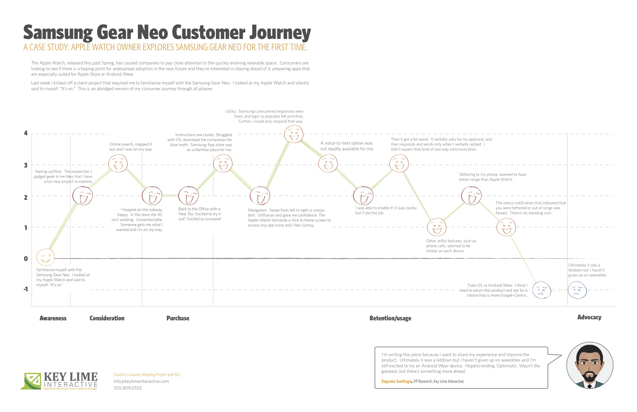
The Apple Watch, released this past Spring, has caused companies to pay close attention to the quickly evolving wearable space. Consumers are looking to see if there is a tipping point for widespread adoption in the near future and they’re interested in staying ahead of it; preparing apps that are especially suited for Apple Store or Android Wear.
About a month ago I unpacked a lime green Apple Watch, paired it with my iPhone and wore it around town. In true researcher form, I found myself paying close attention to every new feature and announcing to my colleagues which features impressed me, and which failed me.
Last week I kicked-off a client project that required me to familiarize myself with the Samsung Gear Neo. I looked at my Apple Watch and silently said to myself: “It’s on.”
I should mention, I’m not an original member of the Apple Fanclub. I stuck to my Samsung Android mobile device for many years as the Apple products evolved. Eventually, I moved to Apple, mostly so that I could keep up on the current offering as much of my project work at KLI demands this. I looked at the Samsung Gear Neo with a wide open mind. I was excited to learn more.
The abridged version of my consumer journey is detailed here, including these typical phases of a consumer journey:
– Awareness
– Consideration
– Purchase
– Retention/Usage
– Advocacy
Awareness:
Last week I kicked-off a client project that required me to familiarize myself with the Samsung Gear Neo. I looked at my Apple Watch and silently said to myself: “It’s on.”
Consideration: Product Research & Purchase
+ 2 Feeling uplifted. The researcher / gadget geek in me likes that I have a fun new project to explore.
+ 1 I took a look on online, CNET.com, the Samsung website, confirmed that particular apps were available and I mapped out the nearest location where these are sold and I was on my way.
Purchase:
– 1 Travel to the store, beautiful outside but quite hot, I hopped on the subway, happy. I walked into the store and the AC wasn’t working, It was stuffy and uncomfortable, overall it sucked. Someone helped me out, got me what I wanted and I was done and on my way.
Back to the Office with a New Toy
+2 Excited to try it out! Excited to compare!
Retention/Usage:
– 1 I open it up and the instructions are clunky. I struggled with the Tizen OS, the pairing options were not straight forward. After re-reading the instructions I recognized that I needed a specific URL to download a companion for blue tooth communication. When I arrived at the Samsung App store, an unfamiliar place for me, I felt I had to fend for myself. No one was waiting to welcome me and show me around, per se.
+ 2 Navigation: Typically, on the mobile experience, you swipe from left to right to move ahead in a variety of different scenarios. On the Samsung Gear, this is consistent. It was intuitive and clear. Utilitarian and gave me confidence in navigating through. The Apple Watch, by comparison, demands that you click to return to the home screen and access app icons in a rhombus shaped cloud, they’re tiny, and I feel clumsy. I liked what I was seeing on the Neo.
Usage:
– 1 Utility: I first took a look at messaging as our first example. Apple executes this well. They have pre-canned text responses that seem to make sense and fit my standard vernacular. They were smart responses to the incoming message. Samsung had this too, but in my anecdotal experience the responses were basic and the associated logic to populate them felt more primitive. Further, I could only respond via precanned text.
– 1 A voice-to-text option was not readily available for me. I eventually found it, after going to my phone to set this up, check through T&C’s, and activating it for use on my watch.
+ 1 I was thankful for that. It was clunky, but it did the job.
-2 Then it got a bit weird. On my Apple Watch I was able to speak my text, review it, and push a button to send the message. On the Samsung I realized that once I was in a scenario where I was using voice-to-text, this was my only option. I’d speak my message, then the system would recognize that I would finish speaking my message and it would cycle through to a screen where I would be prompted to approve of the message. It verbally asks for my approval, and then responds and sends only when I verbally replied. I found it to be a bit uncomfortable that the watch was talking to me during instances when I didn’t expect that kind of two-way communication.
0 Other utility features, such as the acceptance of an incoming phone call, for example, seemed to be similar on each device.
+1 Wearing it for a longer period: Tethering to my phone: I will say that without running a full technical analysis, it seemed to me that the Samsung watch seemed to have better range, so that was a positive.
-1: However, the status notification that indicated that you were tethered or out of range was flawed. Samsung notified me that I was no longer connected, but after that point in time identified no icon or indicator that I was disconnected. If I missed the notification prompt I may not have known that I needed to reconnect or get closer until I actively attempted an activity. Apple has a standing icon.
-2: The Samsung Gear was released in spring 2014. Shortly after the Android Wear release was made for select hardware devices, not including the Neo, it continued to run on the Tizen OS. I think I need to return this product and opt for a choice that is more Google-Centric. I’d liked to have explored a more seamless experience, the “cue card”, full integration with my mail, and more.
Advocacy:
I’m writing this piece because I want to share my experience and improve the product. Ultimately it was a letdown, but I haven’t given up on wearables and I’m still excited to try an Android Wear device. Hopeful ending. Optimistic. Wasn’t the greatest, but there’s something more ahead.
It’s been a few years now, but I recall distinctly when the transition to mobile in the travel industry happened. I was in the midst of traveling often for business and I said to Sidra Michon, Product Usability Manager at KAYAK, that I felt like I needed to sort hotels by “Free access to print your boarding pass”. She chuckled at how real my problem was. A few months later, Brian Sullivan, then at Sabre, suggested to me that I wouldn’t need anything but my phone (my shiny new iPhone, that was) in the coming months.
Then, it was a domino effect. I could book my flight, complete a purchase for my luggage, use my phone as a boarding pass, book a hotel, check in, aggregate my travel itinerary, order takeout to my hotel room, hail a cab, use Wi-Fi on the flight and in the airport, map my route, even if walking in NYC. I could dictate emails while in transit, listen to webinars via conferencing software, check the CRM system for updates, get notified about travel changes and delays. The single most powerful tool that I had available was my smartphone. I didn’t need a wallet, a computer or a pen.
Today’s travelers are exactly as Moxie describes: “Tethered, Tolerant and Talking vs. Mobile, Multitasking and Messaging”. They need to be reached in different ways. Dana Bishop, primary report analyst and Director of Quantitative Research, was awed by the mad scramble of traditional travel companies to throw their hat in the “last minute arena”, as she puts it. It seemed that this Mobile, Multitasking and Messaging culture wants instant, satisfying and simple, too.
As a result, the Competitive Report Division of KLI, run by Bishop, recently announced a new report in our Competitive Index portfolio that focuses on overall functionality and experiences offered by today’s last minute hotel booking apps. Titled Last-Minute Hotel Booking Mobile Competitive Index Report, KLI reviews sixteen (16) apps including those designed specifically for booking last-minute travel as well as the top OTAs in the U.S.
This is more than an industry standard travel technology survey. KLI asks users traditional questions about their current behavior to understand trends, but they push to learn about the innovation that consumers are buzzing about, what they expect to see next, what barriers to a perfect experience exist.
“With many players in direct competition to secure a place to rest your head while traveling, the indecision about which booking agent or OTA to use can be paralyzing to the user.” says Phillip McGuinness, report contributor. “As with all of our reports, we survey the target audience to see what they need and want in terms of features and capabilities first. Then, we take those desires into consideration when comparing and ranking the apps, giving more weight to consumer’s top priorities.”
The review examines their iPhone and Android apps (where applicable) and ultimately ranks the apps, awarding top rank to those who most effectively meet the consumer’s self-defined need.
Buyers receive a detailed report that identifies the survey results and the associated ranking of the 16 apps. They also benefit from detailed best-in-class features including screen prints and expert analysis. Opportunities for improvement are discussed as well as a new trends and innovation section where new concepts such as the use of an app to open hotel room doors or a mobile chat feature to communicate with hotel staff are highlighted.
“Differentiation such as the ability to set style preferences, access customer reviews, set filters, as well as view saved search history and favorites become apparent. Better, the impact that these features have on the user experience or the ability to meet user preferences is identified.” states Bishop. “Organizations crave both a way keep pace with what consumers want as they build their roadmap while also tracking and scoring themselves against the competition; to have a baseline that they want to beat as they continue to evolve. This offers them just that.”
Read the full press release here.
To purchase the published report, please reach out to Key Lime Interactive for more information here.
The Gaming Analytics Summit held in San Francisco brought together a nice crowd of headliner video games such as Minecraft, Call of Duty, Destiny, Angry Birds, and Candy Crush. In attendance were the big gaming giants such as Sony PlayStation, Xbox, Activision, and Electronic Arts. Being an avid gamer and data analyst made this conference extremely informative. The topics ranged from in-game analytics to building a company structure that best handles big data. My focus at this conference was to see how the user’s voice was being heard in the video game development pipeline. Qualitative interviews meant very little to this group who focus more on big data and analytics, but some companies set themselves apart by emphasizing the importance of the user in maximizing their earning potential.
With so much data available from in-game selections, purchases, and behaviors; capturing and analyzing data in such volume has to be highly efficient, lightweight, and funneled into a visualization that is simple enough to consume and draw conclusions. Sega’s entire presentation was about the importance of simplicity and consistency in analysis and visualizations. It clearly demonstrated the challenges of presenting huge bar graphs in reports that are difficult to digest. Following Sega’s presentation, I noticed a theme: Big Data, Big Results, Now What? Attention was placed on displaying data, but not on determining the next course of action.
Candy Crush’s presentation also grabbed my attention. The presenter offered one listener a choice between a mobile power pack and a Rubix cube. The listener chose the Rubix and the speaker said, “now that we know what he chose we can determine some things.” I spoke up during Q&A. “My question throughout the presentation was ‘Why did he choose the Rubix? Doesn’t understanding ‘why’ make your content delivery algorithms more relevant?” He was a bit perplexed and said they just try to do their best to analyze the data they have to learn about users. I responded, “Wouldn’t it be easier just to ask?” It seemed that there was little attention paid towards why users behave the way they do. All focus was placed on A/B testing to determine the best conversion rates. While this method may work, it also presented a very wasteful practice of blind A/B testing.
Just when I thought the user was being completely left out, Alex Leavitt from Sony PlayStation emphasized the importance of User Research in his presentation. He mentioned that his focus was on “Game Science”, which is comprised of game analytics, user research, and gaming design. He continued that integrating user research data into the design process is critical to challenging developers’ design intuitions. The slides shown in the picture demonstrate the need for user research to be experience focused, data informed, and player driven; but also that it should be interwoven into the entire development cycle.
The smoking gun to tie everything back came in a case study of Angry Birds development company, Rovio. This study focused on re-activating gamers that have not been playing as frequently. More activity means more chances they will pay for something in-game. The solution was relevant content. Behavioral patterns, feedback, and ratings were used to better personalize the in-game rewards and messaging, which significantly improved conversion rates and reactivation. Minecraft followed suit by emphasizing the importance of building gamer personas to better understand users. The use of gamer personas by Minecraft demonstrated a big data trend for personalization. Personas may not give the details of every type of user, but it does create a personal connection to a type of users that may be a large portion of your customers. Personas can help narrow the gap between advertising and intrusion. Knowing the needs of the gamer and serving them relevant content or preferred in-game rewards makes a game more addicting and more profitable.
I received my Apple Watch this past Thursday. I chose the space grey Apple Watch sport with the black band, which was worth the wait. It’s fairly subtle, with one person (okay, a kid!) thinking it could be a real watch. Overall, I am impressed with its performance, especially for a v1 device with limited connectivity options. Powered by my iPhone 6, even on LTE instead of wireless, there is very little lag in most apps. However, the remote app has some issues connecting to iTunes libraries. It’s fantastic as a remote for the Apple TV, but very limited and challenging to sync with my computer’s iTunes library.
Performance at home is fantastic. I was able to leave my phone in my bedroom and wander all over my apartment with the watch. I made calls on it of durations between 30 and 40 minutes with no problems. I will say the speakers could be a bit stronger, though. It’s hard to hear people if they’re speaking quietly, or also on speakerphone. Messages and alerts come through in real-time, though. Pleasantly, if you’re interacting with an app on another device you do not receive an alert on the watch. While this makes sense, it isn’t true for the iPhone/iPad, so it was a great software addition that should come to more devices in the family.
I was deeply impressed with its performance in transit. Using Bluetooth, the watch is still connected to your phone so you can change music or get activity updates while underground with no cell service. Where there is cell service, it will push notifications to you. I was expecting the watch to be fairly useless while traveling, but that is certainly not the case.
It’s useful while at work. Again, the performance over LTE has few noticeable lags for any app, apart from maybe 5-10 seconds sometimes for NYT updates. The calendar alerts are fantastic. They pop up 10 minutes before your meeting and let you scroll through all of the meeting details. There’s even an option to email the meeting creator, which is the only email option I’ve seen on the watch so far. The dictation is good enough that I wish they allowed text responses to emails. It would be a really useful update. My biggest frustration while using it at work was when I went out of range for a meeting in a far conference room. I didn’t bring along my phone because the watch was a great substitute, but it didn’t alert me as I was exiting its range. Some sort of notification would be helpful, as it’s challenging to gauge distances, especially inside buildings.
The messages app is delightful to use. Being able to dictate messages makes it extremely functional. However, the feature could be improved by making it easier to edit these messages. I’ve definitely found myself canceling messages and re-dictating them due to one or two incorrect words in places that would make overall comprehension challenging. I would also like to be able to send the messages without having to touch the watch. There currently isn’t a verbal command that lets you send a message. Despite these usability challenges, I still found myself sending the majority of my text messages this weekend using the watch. It’s the easiest way to send text messages I’ve seen so far, though it would definitely be improved by easier (or any!) editing capabilities and a way to send without touching it.
Email is surprisingly functional on the watch. Initially, I assumed it would be just notifications, but you can scroll through the entire email. Not everything renders on the watch, especially graphics, but you can see the entirety of provided text, which is very useful. My biggest pain point when using the email feature was how difficult it was to delete emails. When I clicked on a notification, I had to scroll through the email to get to the delete option. In your mailbox you can swipe for a trash option, but as a notification that only gives you the option to clear notifications. Being able to delete from the notification without scrolling through the whole thing would be a useful addition.
My largest gripe centers around Apple Pay. Figuring out how to add a card to the watch was NOT intuitive. It kept directing me to my phone, but I assumed it was the regular Passbook section. I tried re-adding my card, but it didn’t let me. I had to Google how to do it to find out it was in the Apple Watch app on my phone. Even then, I had to re-verify my card for the watch by calling my credit card company. When I tried to use it at Whole Foods by tapping the button twice it kept telling me it was ready, but ultimately it was unable to make the payment. Obviously, this was pretty frustrating. I ended up using my phone. Seeing as the watch is likely one of Apple’s best chances at making Apple Pay catch on, it’s a shame this was the least intuitive watch experience I had all weekend. This experience should definitely be improved. The Apple Pay on-boarding would have been easier with a diagram clearly illustrating where to go on the phone. The BEST solution would be letting me choose on the watch whether to add the credit cards from my phone. I don’t see why I need to go through the phone. I’m not sure why it doesn’t work in stores, but that’s definitely a huge issue that needs to get fixed.
The native activity app is interesting. I’ve given it a small amount of information and it’s been making attempts to inspire me to greater efforts. I personally am not a super active person, but what I like about the activity app as it exists currently is that it works with you. It’s not being overly critical or alerting me too frequently, both of which would result in me turning it off. It’s sitting there in the background letting me know when I’ve hit a goal or reminding me when to stand up. I don’t listen to every stand reminder, but I’ve listened to more than I’ve ignored. I’m curious to see if it changes my behavior over time. It’s definitely a much better way to interact with this information than the Health app on the iPhone, which I’ve always found oddly buggy.
Of the 3rd party apps I’ve interacted with so far on the device, I’m most impressed with the New York Times app. They’ve done a wonderful job of creating a new kind of article specifically for the watch. Some articles feature just a headline, some have pictures, and some have 1-2 sentences. It’s a fun surprise to scroll through them a few times a day. I do hope in the future it’s possible to read full shorter articles on the device, but I understand their choice and think it makes a lot of sense for the watch that exists today. 95% of my interaction with the NYT iPhone app is through notifications, so NYT on the watch is an ideal match. Now I actually get more information with the brief articles and images. I prefer the tablet for actual reading, but again I would be interested in having a more email-like experience for the NYT.
While I was initially unimpressed with the battery life, it was fine over the weekend. It does drain my phone battery faster, BUT it means I’m spending significantly less time on my phone so that evens it out for the most part. Like all Apple devices, I would appreciate a longer battery life, but I will say it survives a 12-hour day much better than the iPhone. Having the two devices has made it possible to have weekend days without airplane mode or constant recharging. Speaking of charging, I wish it were possible to wear the watch while charging it. One of the best use cases for me so far has been using the watch to act as an Apple TV remote. I do most of my Apple TV watching at night, so it would be great to be able to plug it in and continue using it. I’m also curious about the watch’s potential as an alarm, given that the taptic feedback might be a more pleasant way to wake up.
At this stage, I would rate the Apple Watch as a ‘nice to have’. If you, like me, own the whole family of devices and upgrade pretty regularly, go for it. It’s an awesome addition to the family, and you’ll find a lot of unexpected uses for it. I think it needs to be able to stand alone, ideally by v2. However, it’s still challenging enough to use that I wouldn’t recommend it to my parents just yet. I do think it will get there, and I will definitely be keeping mine and not returning it. Its best uses for me are: messaging, Apple TV remote, email, and keeping me off my iPhone (supposedly the #1 secret purpose). Those are important enough things in my life that I find value in a device that improves my access to them.
Note to Apple: I would be happy to put a $5 data share plan on it so I could leave my phone behind while at conferences, meetings, bars, parties, etc.