The Apple Watch, released this past Spring, has caused companies to pay close attention to the quickly evolving wearable space. Consumers are looking to see if there is a tipping point for widespread adoption in the near future and they’re interested in staying ahead of it; preparing apps that are especially suited for Apple Store or Android Wear.
About a month ago I unpacked a lime green Apple Watch, paired it with my iPhone and wore it around town. In true researcher form, I found myself paying close attention to every new feature and announcing to my colleagues which features impressed me, and which failed me.
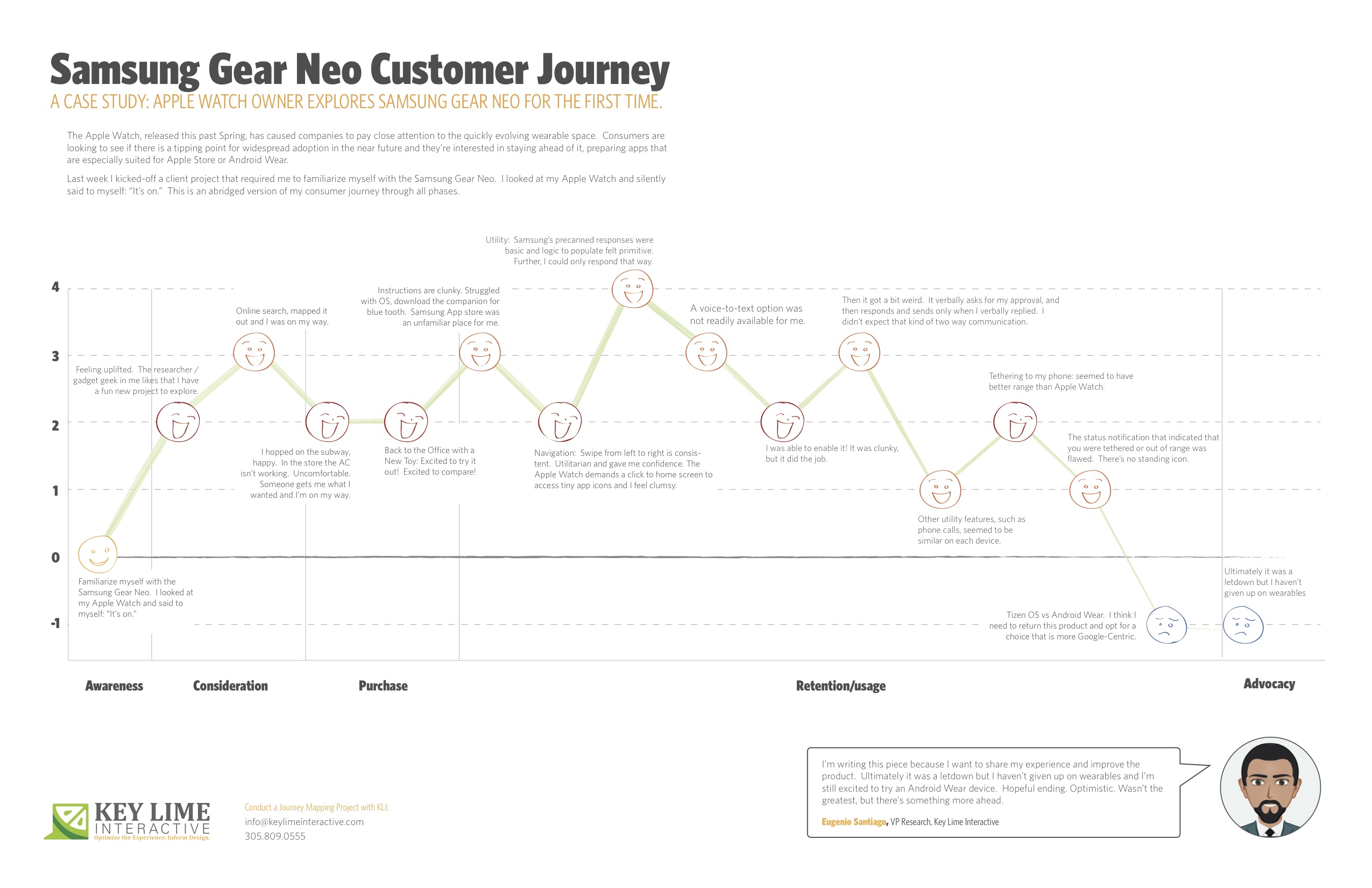
Last week I kicked-off a client project that required me to familiarize myself with the Samsung Gear Neo. I looked at my Apple Watch and silently said to myself: “It’s on.”
I should mention, I’m not an original member of the Apple Fanclub. I stuck to my Samsung Android mobile device for many years as the Apple products evolved. Eventually, I moved to Apple, mostly so that I could keep up on the current offering as much of my project work at KLI demands this. I looked at the Samsung Gear Neo with a wide open mind. I was excited to learn more.
The abridged version of my consumer journey is detailed here, including these typical phases of a consumer journey:
– Awareness
– Consideration
– Purchase
– Retention/Usage
– Advocacy
Awareness:
Last week I kicked-off a client project that required me to familiarize myself with the Samsung Gear Neo. I looked at my Apple Watch and silently said to myself: “It’s on.”
Consideration: Product Research & Purchase
+ 2 Feeling uplifted. The researcher / gadget geek in me likes that I have a fun new project to explore.
+ 1 I took a look on online, CNET.com, the Samsung website, confirmed that particular apps were available and I mapped out the nearest location where these are sold and I was on my way.
Purchase:
– 1 Travel to the store, beautiful outside but quite hot, I hopped on the subway, happy. I walked into the store and the AC wasn’t working, It was stuffy and uncomfortable, overall it sucked. Someone helped me out, got me what I wanted and I was done and on my way.
Back to the Office with a New Toy
+2 Excited to try it out! Excited to compare!
Retention/Usage:
– 1 I open it up and the instructions are clunky. I struggled with the Tizen OS, the pairing options were not straight forward. After re-reading the instructions I recognized that I needed a specific URL to download a companion for blue tooth communication. When I arrived at the Samsung App store, an unfamiliar place for me, I felt I had to fend for myself. No one was waiting to welcome me and show me around, per se.
+ 2 Navigation: Typically, on the mobile experience, you swipe from left to right to move ahead in a variety of different scenarios. On the Samsung Gear, this is consistent. It was intuitive and clear. Utilitarian and gave me confidence in navigating through. The Apple Watch, by comparison, demands that you click to return to the home screen and access app icons in a rhombus shaped cloud, they’re tiny, and I feel clumsy. I liked what I was seeing on the Neo.
Usage:
– 1 Utility: I first took a look at messaging as our first example. Apple executes this well. They have pre-canned text responses that seem to make sense and fit my standard vernacular. They were smart responses to the incoming message. Samsung had this too, but in my anecdotal experience the responses were basic and the associated logic to populate them felt more primitive. Further, I could only respond via precanned text.
– 1 A voice-to-text option was not readily available for me. I eventually found it, after going to my phone to set this up, check through T&C’s, and activating it for use on my watch.
+ 1 I was thankful for that. It was clunky, but it did the job.
-2 Then it got a bit weird. On my Apple Watch I was able to speak my text, review it, and push a button to send the message. On the Samsung I realized that once I was in a scenario where I was using voice-to-text, this was my only option. I’d speak my message, then the system would recognize that I would finish speaking my message and it would cycle through to a screen where I would be prompted to approve of the message. It verbally asks for my approval, and then responds and sends only when I verbally replied. I found it to be a bit uncomfortable that the watch was talking to me during instances when I didn’t expect that kind of two-way communication.
0 Other utility features, such as the acceptance of an incoming phone call, for example, seemed to be similar on each device.
+1 Wearing it for a longer period: Tethering to my phone: I will say that without running a full technical analysis, it seemed to me that the Samsung watch seemed to have better range, so that was a positive.
-1: However, the status notification that indicated that you were tethered or out of range was flawed. Samsung notified me that I was no longer connected, but after that point in time identified no icon or indicator that I was disconnected. If I missed the notification prompt I may not have known that I needed to reconnect or get closer until I actively attempted an activity. Apple has a standing icon.
-2: The Samsung Gear was released in spring 2014. Shortly after the Android Wear release was made for select hardware devices, not including the Neo, it continued to run on the Tizen OS. I think I need to return this product and opt for a choice that is more Google-Centric. I’d liked to have explored a more seamless experience, the “cue card”, full integration with my mail, and more.
Advocacy:
I’m writing this piece because I want to share my experience and improve the product. Ultimately it was a letdown, but I haven’t given up on wearables and I’m still excited to try an Android Wear device. Hopeful ending. Optimistic. Wasn’t the greatest, but there’s something more ahead.
by Kathleen Henning and Phil McGuinness In part two of our series on mobile payments, Phil and Kathleen review a few exciting mobile payment options and talk about the near future of mobile payment technology.
Phil: In part one, Kathleen and I field tested the PayPal and Google Wallet apps, two popular forms of mobile payments. However, there are a few up and coming forms of payment that take a different approach to the process.
Softcard/ISIS
Due to an unfortunate coincidence, the company ISIS is in the process of changing its name to Softcard to avoid sharing its name with a militant terrorist group. However, that’s not the only obstacle facing Softcard. While Google Wallet restricts the use of Near-Field Communication (NFC) payments to Android, Softcard is bringing these payments to the iPhone as well. In order to do that, users need to make a one-time investment in a special phone case (minimum of $50).
Requiring users to invest additional money to make payments creates a difficult barrier to adoption, especially when NFC payments aren’t yet accepted on a widespread basis. Softcard does, however, address one of our gripes about Google Wallet. It allows users to search for local stores that accept NFC payments. The app also boasts numerous security features on their site, including a PIN entry required before each purchase, the ability to freeze your wallet remotely, as well as using unique transaction IDs for each payment.
LoopPay
Instead of relying on NFC, consumers have another option in LoopPay. LoopPay gets around NFC by imitating credit cards in a way that allows the familiar credit card readers to get the signal. This allows LoopPay to work in almost any store, using the technology that’s already in place. As with Softcard, though, this also requires the user to make an initial investment. At this time, Loop Wallet provides the option of a reasonable $39 for a key fob, or $99 for a charging phone case and key fob.
As NFC adoptions treads water, LoopPay is an interesting alternative to watch. At the time of this writing however, Apple is expected to announce NFC as a standard in the iPhone 6, which could change the field dramatically. Kathleen, our resident Apple expert, will break down the rumors and implications this could have later in the article.
Coin
Another interesting option in the mobile payment field is the Coin Payment Card. This works similarly to LoopPay, but instead of requiring a fob or charging case, users can store their cards in a credit card-shaped item and switch between them at the tap of a button. This has the added benefit of removing any questions of NFC adoption or security concerns with wirelessly transmitting credit card information. In addition, it provides the comfort of a payment process with which both users and vendors are familiar. There is no need to fumble with a mobile app or worry about having mobile service if you can simply hand a card to a waiter or cashier.
Another neat feature unique to this system is added security through a Bluetooth tether. Coin uses a low-energy Bluetooth signal to connect with your phone, which will then alert you if you get too far away from the card, say by walking away from a shop and leaving it on the counter. So what’s the downside? Again, users need to invest in the card, and right now it is still in the crowd funding stage. Early investors can buy the card for $50, and once it’s released it will retail at $100. If somehow Coin can manage to bring the price down, I could see this being widely adopted by consumers interested in both familiarity and security.
Now, Kathleen will talk about Starbuck’s success with mobile payments and Apple’s likely upcoming adoption of NFC in the new iPhone.
Starbucks
The best part of the Starbucks app is how little effort it involves. Once you enter in your gift card number and the 8-digit identifying code on the back, you’re good to go. You can add money via the app, set it up to automatically reload when running low, and even add it to iOS’s Passbook. Using it in the store is a seamless process. Unlike some of the other apps we’ve tested, it just works. You don’t have to think about it, and since the store has integrated it on their end paying by app is as natural as paying by credit card. This too works independently of NFC capabilities.
Starbucks in Korea has a new feature called Siren Order. Customers can enter in their order details and receive a QR code, which is scanned by baristas at the counter. Starbucks is thinking about rolling out app preorder capabilities in the US in the next three to six months.
Apple Pay
As of September 8, 2014, Apple has entered the mobile payments field with Apple Pay. As of January 2014, 42% of smartphone owners in the US own some model of iPhone, many of these older models. Apple Pay will work on the iPhone 6, the iPhone 6 Plus, and the Apple Watch. Users will scan the front of their credit/debit card, enter the CVV, and be able to make payments. Apple will generate a unique code each time a user wants to make a payment. This will work in physical stores, online, and in apps. Merchants like Starbucks, Whole Foods, Duane Reade, Disney, Bloomingdale’s, and Uber are already signed up. American Express, Visa, MasterCard, and most major US banks are currently participating on the credit/debit card side. I look forward to seeing how this transforms the mobile payments process, hopefully for the better!
Personally, I’m optimistic for a trickle down effect to smaller merchants by next summer so it can be available at Smorgasburg and Governor’s Ball. A lot of the payments systems we’ve showcased are promising, but none of them have gained widespread adoption. I’m hoping Apple’s entry into the market will change this outcome.
After a challenging experience with mobile payments at a New York music festival, our researchers decided to get together and assess two of the leading mobile payment options currently on the market. In Part One of this two-part series, we field test PayPal and Google Wallet apps on both iPhone and Android smartphones. Next month, we’ll review the mobile payment landscape and share some interesting new developments.
Let’s see where Kathleen Henning and Phil McGuinness stand on these mobile giants.
Kathleen: As I was preparing to attend the Governor’s Ball festival this summer, I was super psyched. Not only did they have an amazing lineup, but the food & drink section asked for my credit card information so I could make mobile payments. Since I hate carrying cash (and really anything), this was a dream come true for me. Unfortunately, it was a little too good to be true. I entered all of my information only to find that no one was accepting the GovBall app as payment. Instead, there was the PayPal app…
Most festivals, for better or worse, are known for having notoriously awful cell service. GovBall was no exception. Using the PayPal app required downloading it, logging in, taking a picture of yourself, and saving your account information. All of those steps required far more Internet speed than was available. Day 1 I had no luck. Day 2 I was able to purchase free Brooklyn Soda Works. Day 3 the vendors I tried weren’t accepting it anymore because of technical failure.
This experience got me thinking, does this app work any better with a stronger signal? Was my experience simply based on the context of the festival? I opened up the PayPal app, looked through the local businesses available, and took a trip to Van Leeuwen’s for a (mostly free) scoop of ice cream with ridiculously delicious fudge. The app worked! And then it crashed my iPhone. However I was able to pay and get the $5 coupon discount and, more importantly, enjoy a little piece of ice cream heaven.
Phil: After Kathleen and I discussed her experience, I went ahead and tested the take out ordering for the PayPal app on Android. I found that it works like any food ordering app. All mobile ordering relies squarely on the structure and capabilities of the Eat24Hours service. My experience with setup was fairly easy, although you have to enter a lot of basic information, including a picture, which might deter some people.
After set up, I found that the app was slowing down the ordering process with numerous errors. At first the PayPal app was stuck on the “delivery” setting for food, and even when I toggled the setting to “takeout” the delivery fee and minimum order remained on screen. The app’s ordering function also repeatedly timed out with a plain text screen reporting an unspecified error. On top of all this, the ordering process was generally very slow to load. Feeling discouraged, I shut down the app for the day and ordered through other means.
One error encountered with PayPal: Despite selecting “Pickup” the app still thought I was ordering “Delivery”.
The next day I opened the app again to order some lunch, and thankfully the process went smoothly. I was able to pick up my food without any hiccups. I hope that the errors Kathleen and I experienced will be worked out over time, so the app can become a more reliable source of ordering.
Google Wallet doesn’t provide a method to find local stores where payment is accepted, limiting its effectiveness as a wallet or credit card replacement
I also reviewed Google Wallet on Android, a mobile payment app whose main point of differentiation is the use of Near Field Communication (NFC) for point-of-sale payments. Since I had already used Google Payments in the past, the setup was quick and easy. The trouble started when I tried to find a location to use the payment method. Google’s site doesn’t provide any list of merchants where Google Wallet payments are accepted. This may be due to vendors being slow to adopt NFC, which is necessary for this type of payment to spread. Unfortunately this leaves the user to find locations themselves, making this convenient method of payment not so convenient. I spent a week in Silicon Valley and a week traveling and I didn’t find a single location to make a payment with Google Wallet. With limited adoption and no means for finding out where this type of mobile payment is accepted, Google Wallet is far from replacing my trusted standard leather wallet.
Kathleen: In this day and age, there’s a lot of potential for mobile payment systems to streamline a manual process. I was at a concert recently where the luxury box seats were offered a paper menu to select menu items and have them brought to your seat. This section was organized by Live Nation, the international promoter. A setting like this one would be perfect for mobile payments. If I could log into my Live Nation app, select what I want from the menu, hit submit, and have it delivered to my seat, I would be so happy!
In conclusion: There are definitely still some usability issues in this area, but we here at Key Lime Interactive are super excited about the future of mobile payments, especially at concerts and music festivals! Next month, we’ll review the current mobile payment landscape, including some novel new approaches to address problems like those Kathleen and Phil encountered above. Until next month…
by Phil McGuinness
A hot topic right now in mobile user experience is the debate between providing an HTML5 web app versus a more traditional Native OS app. Simply put, HTML5 is a method of programming a mobile website to behave like an app (think m.youtube.com) which can be accessed through any modern tablet or smartphone browser. Conversely, apps written for a Native OS are developed to run directly on Android or iOS smartphones (they are designed for each native platform), and must be downloaded through the GooglePlay Store or Apple App Store. Both approaches are a great way to provide web content to smartphone and tablet users, and they each have their own strengths and weaknesses. Which of these approaches is right for your business? At Key Lime Interactive, we are exploring this question in depth, and have key information to help you make the right decision.
From a development standpoint, HTML5 is the clear winner in both cost and flexibility. If your business has a website, it’s a given that you already have programmers on hand who can write HTML5 code. In addition, your programmers will only have to program the basic code once. Of course, during QA testing some minor edits will need to be made in order to support different browsers and browser versions in the marketplace such as Chrome, Safari, Explorer and more. It’s also important to note that since your code lives on the web rather than on a user’s device, you can make changes on the fly without having to roll out a new application update via an App Store update every time you make a change.
If you decide to make a Native OS app, you will need to hire a team who know the specific language for each operating system, or a jack-of-all-trades programmer who knows all of the relevant languages. These programming skills are much less common, and therefore, can be more expensive, than HTML5-only developers. In order to provide a robust and compelling experience for each OS, you’ll need someone who understands the nuances of each platform. This requires a developer who can write for each operating system, and that’s no small task. If you decide to go the path of a a Native OS app then you’re developing for both Android and iOS and that means you’re now doubling every step of the cycle, including programming, testing/QA, and maintaining the code. When it comes time to update your apps, you’ll also need to release an update two versions via the GooglePlay Store or the Apple App Store.Publishing via either store requires approval before your app can be made available for download.
So why use the Native OS app approach at all you might ask? It sounds expensive AND time consuming. We would submit that developing for a Native OS platform is the right choice. This approach excels at something that we at KLI hold near and dear to our hearts: you guessed it, user experience! Currently, an HTML5 mobile site compete to a Native OS app in look, feel, functionality, and overall speed. Of course, Android and iOS platforms have quirks which make for a unique user experience on each device but the robust and rich UX is worth the price of admission. See our previous article for a detailed discussion about how Android users can be alienated by seemingly insignificant design choices. When building an HTML5 web app to be standardized across all devices, you lose the custom feel ofa Native OS app.
The functionality advantage for Native OS apps comes partially from a better support system – not only from Apple and Google – but from the online community of app programmers – and also from the apps being installed directly on the device. This allows easy access to smartphone features such as the camera, calendar, or contacts. HTML5 web apps are starting to add these functionalities as programmers begin to develop clever new approaches, but equivalency is a long way off at this point in time. Finally, it is well known throughout the industry that the HTML5 web apps react significantly slower than Native OS apps in both UI and load speed. These factors combine to create a smoother, faster, and more intuitive user experience for a Native OS app. The other main areas differences between these two approaches relate to security, monetization, and accessibility, which will vary in importance can be depending on what you want from your app. Native OS apps have better security since the code and URL strings are not accessible like they are in an HTML5 web app. If you happen to want your app to be accessible online, you’ll need to stick with Native OS. To rely on an existing app store for monetization, you’ll need to either build a Native OS app, or use a program like PhoneGap to “wrap” your HTML5 web app to make it appear as an app in the app store that users can download, although it only behaves as a link to the web app itself. Of course, selling your app through an app store means giving away a cut of the profit to the owner of that store/ HTML5 web apps allows you to create your own monetization strategy and avoid the App Store fees.
In conclusion, it takes careful consideration of your business, and knowledge of each approach to make the right decision for you. Do you need a less expensive, low-frills, dynamic experience? If so, an HTML5 web app would be the best approach for you. However, if your major concerns are usability, performance, and security, and you have a little room in your development budget, then a Native OS approach is the way to go. In our opinion, until HTML5 can catch up to the user experience provided by Native OS apps, enterprise companies will almost always want to represent themselves with Native OS apps for the enhanced usability and unparaelleled user experience. In the coming months, Key Lime Interactive will be conducting a study to measure the current user experience of HTML5 web apps, so stay tuned for more detailed information in a future newsletter.
Android is now the number one Mobile platform worldwide and as a result we’re seeing an increased interest among our clients in how to compete in the global application marketplace. Google Play, formerly the Android Marketplace has become the competitive hot spot for installations onto mobile devices and tablets, yet; somehow, a number of apps/app developers are getting it wrong! We’ve noted that a number of players have yet to adhere to the defined Android OS development guidelines. Let’s take a look at a few examples where a clear understanding of guidelines would improve the usability of a provided app.
Take figure 1: The Chase Mobile app.
A few issues jump out that appear to be quick-fix usability problems. First, the bottom menu bar seen here is being phased out because newer phones don’t possess the touch buttons that run on Android 4.1 (Jellybean). You might note that it also takes up a considerable amount of screen space making it undesirable. On the right hand side you can see the right pointing carets (sic) which are an iOS feature, not an Android OS feature. Additionally, at the top there is no indication of which app you’re presently using, or how to navigate backward to previous screens. We’re thinking that there should be an action bar of some kind to help with navigation within the app. Finally, after looking more closely at figure 1 you may have also noted that there is no Chase Bank insignia or identification. Despite the familiar design for iOS users, the app seems to have a number of usability issues that are easy to identify. While an iOS user may find this App is easy to use, Android OS users have reportedly found the interface to be confusing and we predict that such a user is at risk to abandon.
Generally, we’ve learned that our Android OS users expect to see apps that are in the Android OS style, design, and user interface (UI). We’ve also noted that when engaged in a head to head comparison, it’s common for Android OS to have a completely different User Experience (UX) than the iOS audience providing evidence to reconsider a direct transfer of iOS designed apps into the Google Play store. Google agrees: “Most developers want to distribute their apps on multiple platforms. As you plan your app for Android, keep in mind that different platforms play by different rules and conventions. Design decisions that make perfect sense on one platform will look and feel misplaced in the context of a different platform. While a “design once, ship anywhere” approach might save you time up-front, you run the very real risk of creating inconsistent apps that alienate users. Consider [following the] guidelines to avoid the most common traps and pitfalls.”
Our biggest bit of advice: Alienating your user base can be dangerous and wreak havoc on your ROI. We’ve seen an increasing investment into the development of Mobile and Tablet Applications and given the spending we recommend careful consideration of your user base when making decisions about how to approach and handle the various operating systems.
Our clients often ask us how to gain a competitive edge against other apps in their product category and we provide several customized options for them. Adherence to these guidelines is the easiest first step. Specifically, one option is to improve the app navigation by using gestures that Android OS users might be used to. A “side swipe” is familiar to Android users, in our user testing we have seen frustration among Android as they repeatedly attempt to navigate to the next screen by trying to use the “side swipe” gesture. A “side swipe” reduces the reloading caused by the back and forward buttons.
Another element that is often overlooked in apps is the use of Android OS style Icons and functions. Something as simple as selecting the date or time has a specific User Interface (UI) that Google specifies as the standard to use. If one deviates from the Android OS “picker” and “spinner” (figure 2), users become confused.
We maintain that the less the user has to think, the better they will be able to do what they want to do within the app. A strong overall User Experience (UX) is an important central function to fulfilling the user’s desired intentions; giving the user the ability to do what they want, when they want it, in an easy and intuitive manner. We’re well versed with what constitutes a strong UX and help our clients bring that to their current and future customers.
We’ve developed an Android OS checklist to quickly determine if your solution is meeting today’s published Android OS guidelines. We encourage you to test your own site: To get your checklist inquire here.