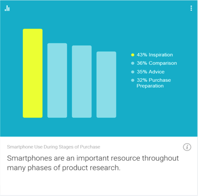
In the technologically advanced and incredibly mobilized world we live in today, there’s constant pressure on organizations and businesses to provide customers with a great mobile user experience. According to Google’s Consumer Barometer and the Connected Consumer Survey (2014 / 2015), 57% of the population currently uses a smartphone. Moreover, smartphones play an integral role throughout various phases of product research. Simply put, people are using their smartphones to read about your business and your products, making it imperative that your mobile site be very user-friendly.
Source: Consumer Barometer with Google – The Connected Consumer Survey 2014 / 2015
So, how do businesses ensure that the mobile experience they’re providing their customers with is a great one? Well, that’s a great question, and a great start to answering that question would be to conduct a mobile usability expert review.
At its core, a usability expert review is an actual usability inspection of your site conducted by a usability specialist in order to identify potential usability issues. A usability expert review is one of the most in-demand, cost-effective usability techniques. Expert reviews are a great way to identify glaring usability blunders. They are quick, inexpensive, and provide an immediate sanity check in regards to your user experience.
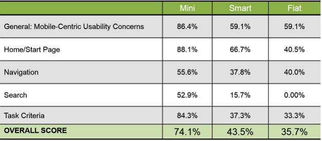
I recently conducted a mobile expert review of three auto manufacturer mobile websites (MiniUSA, SmartUSA, and Fiat) in order to assess their overall user experience and ease of use. I used a handful of usability metrics and assigned scores to each of them in order to determine which mobile site was the most user-friendly. Here are some of the top-level findings and results from my review.
Usability Metrics
General: Mobile-Centric Usability Concerns – Is the site optimized for mobile?
Home / Start Page – Are key tasks easy to locate on the home / start page?
Navigation – Are there convenient and obvious ways to move between pages and sections and is it easy to return to the homepage?
Search – Is it easy to locate the search box? Can you easily filter/refine search results?
Task Criteria – Is the info on the site presented in a simple, natural and logical order?
Top-Level Findings
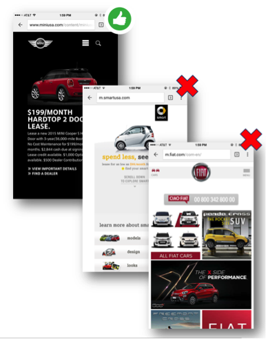
Location of search icon was quick and intuitive on the MiniUSA site – Quick access to search is a must these days. The MiniUSA site was the clear winner in this respect, as SmartUSA and Fiat failed to provide a search feature on their homepage.
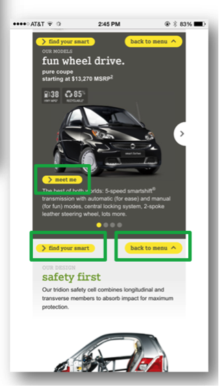
Uncommon, small CTAs were problematic on the SmartUSA site – Several CTA’s, such as ‘meet me’, ‘back to menu’, and ‘find your smart’, on the SmartUSA site proved to be quite confusing, as it’s not clear where users would be taken if they clicked/tapped on these CTAs. Also, with very precise touch targets, the CTAs were very small and difficult to tap on.
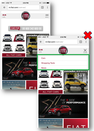
Homepage on the Fiat site provided minimal direction – It was not intuitive where to begin a search when looking to buy/lease an automobile. Additionally, while the burger menu was easy to see and access, it provided options far too vague for users to know where they needed to go subsequently to continue their search.
Now that I’ve shared a few examples from an expert review of my own, here are some tips for how to conduct an expert review of your own. While conducting an actual usability test of your mobile site is the ideal route, conducting a quick usability review is still a great start!
Tips for Conducting a Mobile Expert Review
Identify the critical goals and tasks of your mobile site –It is imperative that you identify the primary goal(s) of your site so that you can know what usability issues are wreaking the most havoc on your bottom line. For example, if you are in the clothing business and you have seen a recent decline in online sales of t-shirts, a crippling usability issue may be present that is preventing users from completing the checkout process, hence the decline in sales. In the e-commerce world, shopping cart abandonment is an extremely widespread issue. Therefore, by conducting an expert review you’ll be able to uncover the specific error(s) occurring at major touch points within the checkout process that are impeding your customers from completing their purchase.
Define your typical users via a customer persona –The majority of web, mobile sites, and applications have typical users who share a relatively familiar set of skills and expertise when it comes to critical tasks. It’s the job of your organization to identify a “Persona”, which is basically a fictional representation of your typical user or customer. Constructing and modifying your mobile site based on your specific customer personas will allow you to custom tailor site attributes such as terminology, information architecture, and navigation schema precisely to the customers that will be interacting with your site most often.
Don’t just look at your site, go use it! –This is the part of the expert review where the hands-on review takes place. Since you’ve already identified the critical goals and tasks of your site, as well as your customer personas, now you can put yourself in the shoes of your customers and go through those critical tasks yourself. Take the previously identified critical tasks and walk through them one at a time as if you were the customer, all the way down to completing the t-shirt purchase (using the aforementioned clothing business example).
Now that you’re equipped with some tips for how to conduct a great usability expert review, you can grab your smartphone and put this recently acquired knowledge to work. Your managers, business owners, stakeholders, and most importantly your customers, will surely thank you!
The Apple Watch, released this past Spring, has caused companies to pay close attention to the quickly evolving wearable space. Consumers are looking to see if there is a tipping point for widespread adoption in the near future and they’re interested in staying ahead of it; preparing apps that are especially suited for Apple Store or Android Wear.
About a month ago I unpacked a lime green Apple Watch, paired it with my iPhone and wore it around town. In true researcher form, I found myself paying close attention to every new feature and announcing to my colleagues which features impressed me, and which failed me.
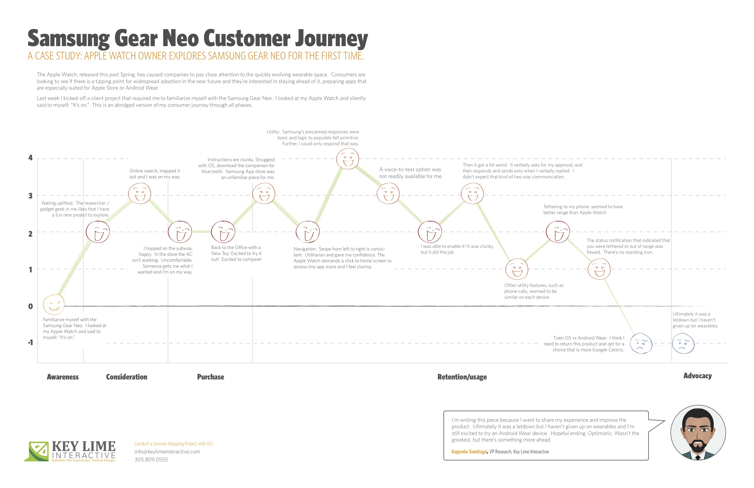
Last week I kicked-off a client project that required me to familiarize myself with the Samsung Gear Neo. I looked at my Apple Watch and silently said to myself: “It’s on.”
I should mention, I’m not an original member of the Apple Fanclub. I stuck to my Samsung Android mobile device for many years as the Apple products evolved. Eventually, I moved to Apple, mostly so that I could keep up on the current offering as much of my project work at KLI demands this. I looked at the Samsung Gear Neo with a wide open mind. I was excited to learn more.
The abridged version of my consumer journey is detailed here, including these typical phases of a consumer journey:
– Awareness
– Consideration
– Purchase
– Retention/Usage
– Advocacy
Awareness:
Last week I kicked-off a client project that required me to familiarize myself with the Samsung Gear Neo. I looked at my Apple Watch and silently said to myself: “It’s on.”
Consideration: Product Research & Purchase
+ 2 Feeling uplifted. The researcher / gadget geek in me likes that I have a fun new project to explore.
+ 1 I took a look on online, CNET.com, the Samsung website, confirmed that particular apps were available and I mapped out the nearest location where these are sold and I was on my way.
Purchase:
– 1 Travel to the store, beautiful outside but quite hot, I hopped on the subway, happy. I walked into the store and the AC wasn’t working, It was stuffy and uncomfortable, overall it sucked. Someone helped me out, got me what I wanted and I was done and on my way.
Back to the Office with a New Toy
+2 Excited to try it out! Excited to compare!
Retention/Usage:
– 1 I open it up and the instructions are clunky. I struggled with the Tizen OS, the pairing options were not straight forward. After re-reading the instructions I recognized that I needed a specific URL to download a companion for blue tooth communication. When I arrived at the Samsung App store, an unfamiliar place for me, I felt I had to fend for myself. No one was waiting to welcome me and show me around, per se.
+ 2 Navigation: Typically, on the mobile experience, you swipe from left to right to move ahead in a variety of different scenarios. On the Samsung Gear, this is consistent. It was intuitive and clear. Utilitarian and gave me confidence in navigating through. The Apple Watch, by comparison, demands that you click to return to the home screen and access app icons in a rhombus shaped cloud, they’re tiny, and I feel clumsy. I liked what I was seeing on the Neo.
Usage:
– 1 Utility: I first took a look at messaging as our first example. Apple executes this well. They have pre-canned text responses that seem to make sense and fit my standard vernacular. They were smart responses to the incoming message. Samsung had this too, but in my anecdotal experience the responses were basic and the associated logic to populate them felt more primitive. Further, I could only respond via precanned text.
– 1 A voice-to-text option was not readily available for me. I eventually found it, after going to my phone to set this up, check through T&C’s, and activating it for use on my watch.
+ 1 I was thankful for that. It was clunky, but it did the job.
-2 Then it got a bit weird. On my Apple Watch I was able to speak my text, review it, and push a button to send the message. On the Samsung I realized that once I was in a scenario where I was using voice-to-text, this was my only option. I’d speak my message, then the system would recognize that I would finish speaking my message and it would cycle through to a screen where I would be prompted to approve of the message. It verbally asks for my approval, and then responds and sends only when I verbally replied. I found it to be a bit uncomfortable that the watch was talking to me during instances when I didn’t expect that kind of two-way communication.
0 Other utility features, such as the acceptance of an incoming phone call, for example, seemed to be similar on each device.
+1 Wearing it for a longer period: Tethering to my phone: I will say that without running a full technical analysis, it seemed to me that the Samsung watch seemed to have better range, so that was a positive.
-1: However, the status notification that indicated that you were tethered or out of range was flawed. Samsung notified me that I was no longer connected, but after that point in time identified no icon or indicator that I was disconnected. If I missed the notification prompt I may not have known that I needed to reconnect or get closer until I actively attempted an activity. Apple has a standing icon.
-2: The Samsung Gear was released in spring 2014. Shortly after the Android Wear release was made for select hardware devices, not including the Neo, it continued to run on the Tizen OS. I think I need to return this product and opt for a choice that is more Google-Centric. I’d liked to have explored a more seamless experience, the “cue card”, full integration with my mail, and more.
Advocacy:
I’m writing this piece because I want to share my experience and improve the product. Ultimately it was a letdown, but I haven’t given up on wearables and I’m still excited to try an Android Wear device. Hopeful ending. Optimistic. Wasn’t the greatest, but there’s something more ahead.
Looking for a cutting-edge, quick and easy way to get your designs from concept to interactive prototype? Working in an agile design environment and need insight into the usability of your concept prior to wireframing? If you answered yes to either of these questions, the POP (Prototyping on Paper) is a design methodology and app you’ll want to check out.
Paper prototypes are not a new or novel concept to the IxD Designer; however, adding interactivity to these paper prototypes is rather new. Enter an amazing app POP. I discovered POP when I was designing a niche market yellow pages app for iOS with a fellow designer at a design bootcamp. We needed a quick, down and dirty way, to test the interactions of our interface. We wanted to validate our design decisions quickly prior to designing the wireframes. A fellow student introduced us to POP.
Using POP is simple. You download the app on your iOS, Android, or Windows mobile phone and start snapping photos of your drawing comps. You can then either work on a desktop/laptop or directly on your mobile phone adding ‘hotspots’ by drawing and dragging active areas and defining what action those hotspots should execute. Link pages together by assigning actions to these hotspots and build a functioning paper prototype of your app in minutes.
Take your concept one step further by using the built-in sharing function of POP. We decided to do some guerilla testing of our initial navigation structure and used the sharing function of POP to share our prototype with friends. We also used Key Lime’s mobile testing tool KLUE to record the interactions and video of the user while interacting with our product. These initial findings helped us tweak our design prior to building and testing wireframes.
Another great feature of POP is the ability to sync with Dropbox and integrate easily into your workflow. Drop photos of your pencil sketches into Dropbox and they immediately appear in POP’s app. Have photos from others working on the same app, share your Dropbox folder and have everyone drop their photos into Dropbox for immediate access to screens from all your team members.
POP is a great app for anyone who needs to quickly gain insight into their designs- heck they even have free downloadable sketch templates for all kinds of mobile devices! Have questions about prototyping on paper, or UX & IxD design in general? Reach out to me- troy@keylimeinteractive.com (UX Research Manager at Key Lime Interactive).
No Reservations? No problem – Competitive Report Reveals Which Last-Minute Hotel App Ranks #1 Key Lime Interactive has expanded their Competitive Report portfolio with a new Competitive Index report for last-minute hotel apps. The report identifies which of sixteen travel industry booking agents and OTA’s best meets consumers self-defined needs.
Miami, FL – Key Lime Interactive’s (KLI) Competitive Research division has investigated the overall functionality and experiences offered by today’s last minute hotel booking apps. In an upcoming competitive report titled Last-Minute Hotel Booking Mobile Competitive Index Report, KLI reviews sixteen (16) apps including those designed specifically for booking last-minute travel as well as the top OTAs in the U.S.
This is more than an industry standard travel technology survey. KLI asks users traditional questions about their current behavior to understand trends, but they also push to learn about the innovation that consumers are buzzing about, what they expect to see next, and what barriers to a perfect experience exist.
Key Lime Interactive recognizes the importance of aligning business-centric goals with consumer-centric needs to produce winning solutions and makes this a core component to all deliverables. This incorporation of user feedback is a primary component for this and all studies across various industries ranging from finance, retail, hospitality, etc. This time, consumers also rank existing features on these last-minute apps and new developments, which takes a pulse of the market.
“With many players in direct competition to secure a place to rest your head while traveling, the indecision about which booking agent or OTA to use can be paralyzing to the user.” says Phillip McGuinness, report contributor. “As with all of our reports, we survey the target audience to see what they need and want in terms of features and capabilities first. Then, we take those desires into consideration when comparing and ranking the apps, giving more weight to consumers top priorities.”
The review examines their iPhone and Android apps (where applicable) and ultimately ranks the apps, awarding top rank to those who most effectively meet the consumer’s self-defined need.
Buyers receive a detailed report that identifies the survey results and the associated ranking of the 16 apps. They also benefit from detailed best-in-class features including screen prints and expert analysis. Opportunities for improvement are discussed as well as a new trends and innovation section where new concepts such as the use of an app to open hotel room doors or a mobile chat feature to communicate with hotel staff are highlighted.
“Differentiation such as the ability to set style preferences, access customer reviews, set filters, as well as view saved search history and favorites become apparent. Better, the impact that these features have on the user experience or the ability to meet user preferences is identified.” states Dana Bishop, primary report analyst and Director of Quantitative Research. “Organizations crave a way keep pace with what consumers want as they build their roadmap while also tracking and scoring themselves against the competition; to have a baseline that they want to beat as they continue to evolve. This offers them just that.”
To purchase the published report, please reach out to Key Lime Interactive for more information at sales(at)keylimeinteractive(dot)com
Researchers, Designers, Executives, Journalists and Bloggers in the Hotel, Travel and Leisure Industry are encouraged to contact Key Lime Interactive with any additional questions.
About Key Lime Interactive
Key Lime Interactive is an user experience research firm with proven excellence in both quantitative and qualitative user and consumer testing. To serve our growing client list of Fortune 100 companies, we conduct competitive research, true intent / voice of customer studies, and prototype studies using quantitative methods. Additionally, we’re experienced in moderating one-on-one interviews/ usability studies, focus groups, and eye-tracking studies for both the traditional and mobile web. Currently, Key Lime is working to help top brands better understand their customer via behavioral personas and customer journey mapping. Ultimately, our goal is to empower teams to use consumer/user experience data at any and all phases of product development; from strategy to implementation. We aim to provide the true perspective of target users and build exceptional consumer-driven solutions.
I received my Apple Watch this past Thursday. I chose the space grey Apple Watch sport with the black band, which was worth the wait. It’s fairly subtle, with one person (okay, a kid!) thinking it could be a real watch. Overall, I am impressed with its performance, especially for a v1 device with limited connectivity options. Powered by my iPhone 6, even on LTE instead of wireless, there is very little lag in most apps. However, the remote app has some issues connecting to iTunes libraries. It’s fantastic as a remote for the Apple TV, but very limited and challenging to sync with my computer’s iTunes library.
Performance at home is fantastic. I was able to leave my phone in my bedroom and wander all over my apartment with the watch. I made calls on it of durations between 30 and 40 minutes with no problems. I will say the speakers could be a bit stronger, though. It’s hard to hear people if they’re speaking quietly, or also on speakerphone. Messages and alerts come through in real-time, though. Pleasantly, if you’re interacting with an app on another device you do not receive an alert on the watch. While this makes sense, it isn’t true for the iPhone/iPad, so it was a great software addition that should come to more devices in the family.
I was deeply impressed with its performance in transit. Using Bluetooth, the watch is still connected to your phone so you can change music or get activity updates while underground with no cell service. Where there is cell service, it will push notifications to you. I was expecting the watch to be fairly useless while traveling, but that is certainly not the case.
It’s useful while at work. Again, the performance over LTE has few noticeable lags for any app, apart from maybe 5-10 seconds sometimes for NYT updates. The calendar alerts are fantastic. They pop up 10 minutes before your meeting and let you scroll through all of the meeting details. There’s even an option to email the meeting creator, which is the only email option I’ve seen on the watch so far. The dictation is good enough that I wish they allowed text responses to emails. It would be a really useful update. My biggest frustration while using it at work was when I went out of range for a meeting in a far conference room. I didn’t bring along my phone because the watch was a great substitute, but it didn’t alert me as I was exiting its range. Some sort of notification would be helpful, as it’s challenging to gauge distances, especially inside buildings.
The messages app is delightful to use. Being able to dictate messages makes it extremely functional. However, the feature could be improved by making it easier to edit these messages. I’ve definitely found myself canceling messages and re-dictating them due to one or two incorrect words in places that would make overall comprehension challenging. I would also like to be able to send the messages without having to touch the watch. There currently isn’t a verbal command that lets you send a message. Despite these usability challenges, I still found myself sending the majority of my text messages this weekend using the watch. It’s the easiest way to send text messages I’ve seen so far, though it would definitely be improved by easier (or any!) editing capabilities and a way to send without touching it.
Email is surprisingly functional on the watch. Initially, I assumed it would be just notifications, but you can scroll through the entire email. Not everything renders on the watch, especially graphics, but you can see the entirety of provided text, which is very useful. My biggest pain point when using the email feature was how difficult it was to delete emails. When I clicked on a notification, I had to scroll through the email to get to the delete option. In your mailbox you can swipe for a trash option, but as a notification that only gives you the option to clear notifications. Being able to delete from the notification without scrolling through the whole thing would be a useful addition.
My largest gripe centers around Apple Pay. Figuring out how to add a card to the watch was NOT intuitive. It kept directing me to my phone, but I assumed it was the regular Passbook section. I tried re-adding my card, but it didn’t let me. I had to Google how to do it to find out it was in the Apple Watch app on my phone. Even then, I had to re-verify my card for the watch by calling my credit card company. When I tried to use it at Whole Foods by tapping the button twice it kept telling me it was ready, but ultimately it was unable to make the payment. Obviously, this was pretty frustrating. I ended up using my phone. Seeing as the watch is likely one of Apple’s best chances at making Apple Pay catch on, it’s a shame this was the least intuitive watch experience I had all weekend. This experience should definitely be improved. The Apple Pay on-boarding would have been easier with a diagram clearly illustrating where to go on the phone. The BEST solution would be letting me choose on the watch whether to add the credit cards from my phone. I don’t see why I need to go through the phone. I’m not sure why it doesn’t work in stores, but that’s definitely a huge issue that needs to get fixed.
The native activity app is interesting. I’ve given it a small amount of information and it’s been making attempts to inspire me to greater efforts. I personally am not a super active person, but what I like about the activity app as it exists currently is that it works with you. It’s not being overly critical or alerting me too frequently, both of which would result in me turning it off. It’s sitting there in the background letting me know when I’ve hit a goal or reminding me when to stand up. I don’t listen to every stand reminder, but I’ve listened to more than I’ve ignored. I’m curious to see if it changes my behavior over time. It’s definitely a much better way to interact with this information than the Health app on the iPhone, which I’ve always found oddly buggy.
Of the 3rd party apps I’ve interacted with so far on the device, I’m most impressed with the New York Times app. They’ve done a wonderful job of creating a new kind of article specifically for the watch. Some articles feature just a headline, some have pictures, and some have 1-2 sentences. It’s a fun surprise to scroll through them a few times a day. I do hope in the future it’s possible to read full shorter articles on the device, but I understand their choice and think it makes a lot of sense for the watch that exists today. 95% of my interaction with the NYT iPhone app is through notifications, so NYT on the watch is an ideal match. Now I actually get more information with the brief articles and images. I prefer the tablet for actual reading, but again I would be interested in having a more email-like experience for the NYT.
While I was initially unimpressed with the battery life, it was fine over the weekend. It does drain my phone battery faster, BUT it means I’m spending significantly less time on my phone so that evens it out for the most part. Like all Apple devices, I would appreciate a longer battery life, but I will say it survives a 12-hour day much better than the iPhone. Having the two devices has made it possible to have weekend days without airplane mode or constant recharging. Speaking of charging, I wish it were possible to wear the watch while charging it. One of the best use cases for me so far has been using the watch to act as an Apple TV remote. I do most of my Apple TV watching at night, so it would be great to be able to plug it in and continue using it. I’m also curious about the watch’s potential as an alarm, given that the taptic feedback might be a more pleasant way to wake up.
At this stage, I would rate the Apple Watch as a ‘nice to have’. If you, like me, own the whole family of devices and upgrade pretty regularly, go for it. It’s an awesome addition to the family, and you’ll find a lot of unexpected uses for it. I think it needs to be able to stand alone, ideally by v2. However, it’s still challenging enough to use that I wouldn’t recommend it to my parents just yet. I do think it will get there, and I will definitely be keeping mine and not returning it. Its best uses for me are: messaging, Apple TV remote, email, and keeping me off my iPhone (supposedly the #1 secret purpose). Those are important enough things in my life that I find value in a device that improves my access to them.
Note to Apple: I would be happy to put a $5 data share plan on it so I could leave my phone behind while at conferences, meetings, bars, parties, etc.
by Kathleen Henning
While interviewing participants about online shopping habits, regardless of the product, the same issues appear:
I don’t know if it’s true to size
Will this fit?
Is this item good quality?
Will it be as pictured?
What is it made of?
These are the questions that determine whether or not they will make a purchase. Many customers, if they do not get satisfactory answers to these questions, will choose to either locate the item in stores or simply purchase something else from a competitor.
When customers are researching products online, they’re trying to understand what the product would look like in person. There are a variety of ways they currently expect companies to help them do this, but their main research method is customer reviews. They’re looking for information about the quality, the fit, the size, the accuracy of the photos, etc. They’re also looking to see if the reviewer is someone like them. In our research, we’ve found that some users really value a reviewer profile with some demographic details (i.e. age, location, style, size, etc.). Users also appreciate retailer efforts to aggregate some of this information, like the size charts Nordstrom and Amazon use.
Recently, retailers have started providing customers with some of this information on their own, like the features and fit. The most critical element of any website trying to sell tangible products is a good zoom feature. If someone is looking to buy clothes, shoes, or furniture, they want to get an up close view. They may want to buy it online, but they’re looking for the feeling of seeing it in person. The more they can see of the item, the more likely they will be to purchase it online. Some websites, like Saks Fifth Avenue and West Elm, have videos of the products available for purchase that show the product ‘in motion’. Customers find this to be very helpful.
When trying to better understand fit, customers are looking to retailers for support. Some users have mentioned that they find it helpful when the site tells them the height of the model and the size he / she is wearing. Others use services like Fit Predictor, available at Saks Fifth Avenue and other department stores. This uses your size in brands you have purchased to determine your size in other brands and different items. The FitPredictor predicts the right size for you based on what size you wear for other brands. For example, if you wear a size 8 jean from The Gap, then the FitPredictor will predict the correct size jean in the brand you’re shopping.
Companies should think about the fundamental product questions their users have when determining which features to include on the product page. Will these features help users make a purchase decision by addressing common issues such as quality, fit, size, color, etc.? While much of the initial decision about an item is visual and focused on whether it fits a shoppers personal style, the final decision is based on whether customers believe they have a full understanding of how that item will fit into their lives.