This blog post is an introduction to Participatory Design (PD) and the methodologies that encompass PD. This is the first in a series of PD themed blog posts, so stay tuned for the next installment!
Participatory Design, User-Centered Design, and Human-Centered Design, all refer to methods which involve users and stakeholders during the iterative design process in hopes of meeting the wants, needs, and affordances of end-users. Participatory Design can be implemented in a variety of ways depending on what type of information the team is trying to capture– from design requirements to usability, the choice is yours.
Participatory Design was initially used in the design and development of computer applications and systems in Scandinavia and was referred to as Cooperative Design (Bødker et al., 2004). As the theory moved westward to the US, the term Participatory replaced Cooperative due to the nature of the first applications in business and the need to stress the vested interest of the participants.
The primary goal of PD is to help provide greater consideration and understanding of the needs and wants of system users. Participatory Design can be used to carefully integrate the needs, perspectives, and contexts of stakeholders, therefore, increasing the likelihood of diffusion, adoption, and impact of the resulting user-centered system.
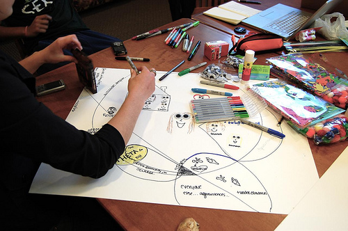
For example, the design of a new mobile yellow page application created to target certain populations and connect users with providers. Wouldn’t it make sense to involve the end-users of this application from the onset of the project? Absolutely! Again, PD can be implemented in a variety of forms, for this example let’s assume we begin by asking our end-users to participate in a design needs session where the design team meets with end-users and fleshes out the necessary design requirements for the mobile app. From the beginning of the project, the users will have their voice heard and incorporated into the design of the final system.
Iterative Usability Testing is paramount to the success of any system, and this is another point where users can assist the design team in shaping the usability of the system. By conducting iterative usability tests, perhaps as short weekly lean UX sprints, the design team and engineers can quickly test and iterate the design of a new system- and be agile in the process.
IDEO has put together its own version of a ‘Human Centered Design Toolkit’. Check it out. Lots of cool techniques, tips, and more to get yourself in the HCD head space.
Remember: by incorporating your users feedback throughout the creation of your system, you are moving towards a better design and adopted system for all stakeholders.
If you have any questions, or want to talk Participatory Design, reach out to us info@keylimeinteractive.com
Bødker, K., Kensing, F., and Simonsen, J. (2004). Participatory IT design: Designing for business and workplace realities. Cambridge, MA, USA: MIT Press.
Have you ever heard the expression ‘failing to plan is planning to fail’? Well, as true as the expression may be, you’ll often find yourself in situations where things such as time or budget constraints are preventing you from being able to adequately plan and prepare. In the UX world, research and planning are king, and neglecting either of those can be disastrous for your organization. So, what do you do when you find yourself faced with some sort of roadblock and traditional research methods are simply not an option? Well, the answer is guerilla research.
Guerilla research is faster, cheaper, and less formal than traditional research methods. It can provide you with quick, effective insight that can save you and your organization a great deal of time and money in the long run. With guerilla usability testing you will not incur any large costs associated with things like travel, lab rentals, expensive recording equipment, etc. As for saving time, guerilla research is extremely quick and you can get insight in as little as a few hours. With this type of research you’ll be operating from the standpoint that some insight is better than no insight. So, even if the testing you conduct is short and sweet, it’s worth it.
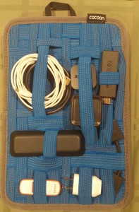
Here is an example of a guerilla usability test I conducted in the past. The objective of this quick test was to learn whether or not users were able to intuitively use some newly proposed icons within a mobile banking app. The bank featured in this example had recently made the transition from a left-hand navigation menu in their mobile app to a more simplistic layout that featured a dock (shown below) of four icons on the bottom of the mobile app’s interface. I tested with 10 participants and tasked each of them with selecting which icon they felt they would use if they wanted to access a list of FAQs. I then watched and listened as users attempted the task, and also shared with me what they felt each of the icons represented and what options they would expect to see within each one.
Results
When tasked with finding a list of FAQs, users were split between tapping on the 3rd icon (the icon with the “?”) and the 4th icon (the cogwheel).
Seven out of the ten users initially tapped on the cogwheel, stating that the icon with the “?” looked like it was where they would go to chat or initiate a communication with customer service, since the “?” was within what appeared to be a chat bubble.
Analysis
In speaking further with users, they said the confusion stemmed from the bubble in which the “?” was located. Participants said that if this were simply a circle, the confusion would likely be alleviated, however, they said the point at the bottom left of the icon made it look far too close to an icon used to represent a ‘Chat’ or ‘Messaging’ feature.
Recommendation
Change the “FAQs” icon to have only a plain circle around the “?” in order to avoid confusion.
Quick Tips for Guerilla Usability Tests
Test with 5-10 participants, but typically no more than 10
Test in a decently quiet, trafficked location like a coffee shop or a cafeteria
Have each participant do only 1-2 tasks in order to keep each session short and sweet
Use very basic screening criteria (i.e. In the above example I shared, I would ask each participant whether or not they currently used a mobile banking app of some sort)
Thank each participant for their time and feedback
The above is just one good example of a guerilla usability test. It might not have been a colossal amount of research and data I gathered, but it was extremely valuable and it only took me a couple hours to get. Now that you have an idea of what a guerilla usability test is and you’ve seen what one looks like, you can get out there and conduct one on your own!
Ask any UX designer or Human Factors researcher about their most memorable moments planning or running usability tests, and you’ll hear some real eye-openers. From challenging client relations, to logistical nightmares, to balky participants, planning and executing a successful usability study requires attention to detail, a deft personal touch, and a fair bit of improvisation in the face of the unexpected.
As a mid-career UX professional who has worked in the financial, healthcare, and medical device fields, I’m constantly thinking about ways to improve not only the quality and delivery of data from studies, but the overall process of planning and executing studies. While there is no single “right” way, there are certainly practices that can better the chances of a successful study.
Here are some useful pre- and post-study activities gathered from experience in the field. Some suggestions might be old hat to seasoned professionals, but if even one of them helps someone avoid stress, lost data or squandered time, sharing them will have been worth it.
Analyze thyself
It can be difficult for ever-busy UXers to step back and make time for the work necessary to interrogate how studies are planned, executed and reported. Yet, planning a short retrospective at the end of each project can ferret out potential areas for improvement that apply not only to the individual study, but to your UX practice as a whole. The devil is in the details, of course; capturing those findings and translating them into action is the real challenge. Subject your own processes to the analytic eye you would turn to a client’s product. Where can they be streamlined or improved?
Do you feel lucky? Well, do you?
Beyond the obvious calamities like no-show participants, minimizing potential problems in study execution comes from experience and the ability to recognize where problems are most likely to occur. If [BAD THING] happened, this session would be totally hosed. Particularly if you are a freelancer or working solo (hence no backup team), assessing the likelihood and impact of those BAD THINGS drives the planning that reduces the risk they will occur and reduces the severity when they do.
Repeat: Redundancy is good for you
Avoid depending solely on digital copies of critical documents. Make sure those digital copies are already downloaded to your laptop because WiFi is ubiquitous until it isn’t. Don’t assume you’ll have time to find a printer at a new study location. Bring paper copies – in particular, several copies of the protocol and discussion guide – organized and ready for quick retrieval.
Similarly, if you are testing material products and are responsible for transporting them to the site, have a teammate bring extra in case of lost or stolen luggage, or a fatigue-induced failure to pack. Consider whether mailing them in advance, with tracking, is an option.
Setting it up
Market research facilities
Know the site coordinator.
Make it crystal clear what front desk staff are responsible for, and assume there will be several shift changes over the day, and that your requirements may not survive the inevitable game of telephone.
For anything more complex than registering and compensating participants, provide the front desk with a clear step-by-step description of who gets what and when. This is particularly helpful if you have multiple Informed Consent Forms for different participant groups, or situations where some participants might return for follow-up sessions while others won’t.
In the field
Know your field site. If at all possible, take a walkthrough before your session to familiarize yourself with where things are, and any potential distractions or complications (discovering you’re on a bus route or in a WiFi deadzone, etc.)
If you’re going to be outside, have a fallback plan for inclement weather or an overly noisy environment.
Overall
Ensure all devices are fully charged before study start. Always have a backup battery or SD card for any devices you are using.
Check your recording devices. If you’re at a market research facility, check whether some camera adjustment is necessary for the best possible view of the participant.
If you are the one with the recording devices or software, ensure you and your team (if you have one) know how they work. Nothing is more frustrating than discovering after the fact that your session audio wasn’t recorded because someone forgot to press a button. Use sticky note prompts if necessary (you laugh, but it works.)
If you’re a solo practitioner running a study, a Livescribe pen that records audio is a great addition to your note-taking arsenal, because it’s much easier to find a particular sound bite in your notes.
Mise en place. A French culinary term that means “put in place,” it’s also an extremely useful tactic to minimize scrambling during study execution. Establish specific locations for critical assets and communicate where they are found. At a facility, lay materials out on a table. If you’re on the go, organize your bag so you know where everything is without fumbling around.
For printed or physical assets, sticky notes make great place labels so your team isn’t forced to rely on memory over a long day. Protocols are here, study guides are there, moderator checklists are over there.
Separate blank materials from anything participants have filled out.
Breaking it down
Tips for when the study is over:
If any assets are to be shipped back to clients or the office, have necessary contact and address information ready.
If you have more than a few items in a box, create a shipping manifesto, and crosscheck before sealing.
Double-check that any forms or physical media have been collected from site staff, and that any digital media has been transferred to portable form, where applicable.
While some of these activities are more relevant to studies involving physical products, most are broadly applicable to usability studies in general. Whether standardized in checklists or simply incorporated into routine practice, these simple organizational activities can help ensure a resilient and successful study.
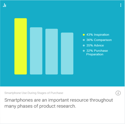
In the technologically advanced and incredibly mobilized world we live in today, there’s constant pressure on organizations and businesses to provide customers with a great mobile user experience. According to Google’s Consumer Barometer and the Connected Consumer Survey (2014 / 2015), 57% of the population currently uses a smartphone. Moreover, smartphones play an integral role throughout various phases of product research. Simply put, people are using their smartphones to read about your business and your products, making it imperative that your mobile site be very user-friendly.
Source: Consumer Barometer with Google – The Connected Consumer Survey 2014 / 2015
So, how do businesses ensure that the mobile experience they’re providing their customers with is a great one? Well, that’s a great question, and a great start to answering that question would be to conduct a mobile usability expert review.
At its core, a usability expert review is an actual usability inspection of your site conducted by a usability specialist in order to identify potential usability issues. A usability expert review is one of the most in-demand, cost-effective usability techniques. Expert reviews are a great way to identify glaring usability blunders. They are quick, inexpensive, and provide an immediate sanity check in regards to your user experience.
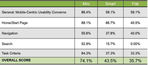
I recently conducted a mobile expert review of three auto manufacturer mobile websites (MiniUSA, SmartUSA, and Fiat) in order to assess their overall user experience and ease of use. I used a handful of usability metrics and assigned scores to each of them in order to determine which mobile site was the most user-friendly. Here are some of the top-level findings and results from my review.
Usability Metrics
General: Mobile-Centric Usability Concerns – Is the site optimized for mobile?
Home / Start Page – Are key tasks easy to locate on the home / start page?
Navigation – Are there convenient and obvious ways to move between pages and sections and is it easy to return to the homepage?
Search – Is it easy to locate the search box? Can you easily filter/refine search results?
Task Criteria – Is the info on the site presented in a simple, natural and logical order?
Top-Level Findings
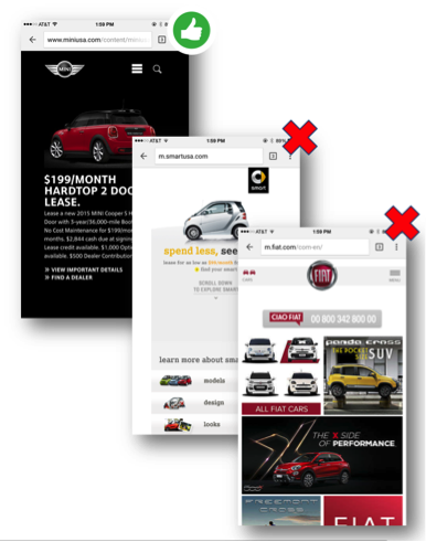
Location of search icon was quick and intuitive on the MiniUSA site – Quick access to search is a must these days. The MiniUSA site was the clear winner in this respect, as SmartUSA and Fiat failed to provide a search feature on their homepage.
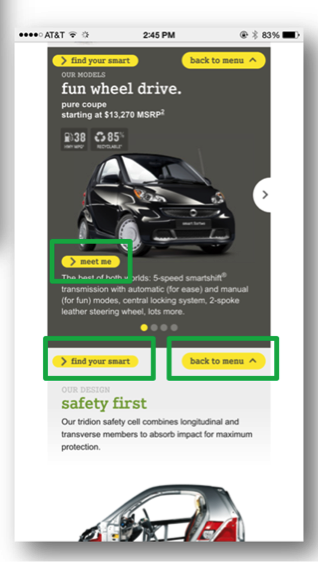
Uncommon, small CTAs were problematic on the SmartUSA site – Several CTA’s, such as ‘meet me’, ‘back to menu’, and ‘find your smart’, on the SmartUSA site proved to be quite confusing, as it’s not clear where users would be taken if they clicked/tapped on these CTAs. Also, with very precise touch targets, the CTAs were very small and difficult to tap on.
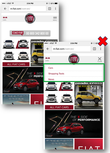
Homepage on the Fiat site provided minimal direction – It was not intuitive where to begin a search when looking to buy/lease an automobile. Additionally, while the burger menu was easy to see and access, it provided options far too vague for users to know where they needed to go subsequently to continue their search.
Now that I’ve shared a few examples from an expert review of my own, here are some tips for how to conduct an expert review of your own. While conducting an actual usability test of your mobile site is the ideal route, conducting a quick usability review is still a great start!
Tips for Conducting a Mobile Expert Review
Identify the critical goals and tasks of your mobile site –It is imperative that you identify the primary goal(s) of your site so that you can know what usability issues are wreaking the most havoc on your bottom line. For example, if you are in the clothing business and you have seen a recent decline in online sales of t-shirts, a crippling usability issue may be present that is preventing users from completing the checkout process, hence the decline in sales. In the e-commerce world, shopping cart abandonment is an extremely widespread issue. Therefore, by conducting an expert review you’ll be able to uncover the specific error(s) occurring at major touch points within the checkout process that are impeding your customers from completing their purchase.
Define your typical users via a customer persona –The majority of web, mobile sites, and applications have typical users who share a relatively familiar set of skills and expertise when it comes to critical tasks. It’s the job of your organization to identify a “Persona”, which is basically a fictional representation of your typical user or customer. Constructing and modifying your mobile site based on your specific customer personas will allow you to custom tailor site attributes such as terminology, information architecture, and navigation schema precisely to the customers that will be interacting with your site most often.
Don’t just look at your site, go use it! –This is the part of the expert review where the hands-on review takes place. Since you’ve already identified the critical goals and tasks of your site, as well as your customer personas, now you can put yourself in the shoes of your customers and go through those critical tasks yourself. Take the previously identified critical tasks and walk through them one at a time as if you were the customer, all the way down to completing the t-shirt purchase (using the aforementioned clothing business example).
Now that you’re equipped with some tips for how to conduct a great usability expert review, you can grab your smartphone and put this recently acquired knowledge to work. Your managers, business owners, stakeholders, and most importantly your customers, will surely thank you!
Are you a User Experience professional who uses online survey tools to deliver insights? If so, you’re in luck! For the last four years, I’ve been working extensively with various online survey tools to deliver everything from simple one-off consumer surveys, to large scale multinational Competitive Benchmarking tests. Throughout that time, I’ve had endless opportunities to experiment with different design methods and survey tools – and to make mistakes, and learn from them – so that you don’t have to. In this article, I would like to share with you some of the potential pitfalls to designing and programming these studies that you can avoid in your next survey. Proper survey design can save you countless hours of frustration when it comes time to analyze the data and deliver your report.
Not Scripting to Your Reporting Tool
Sometimes when you script a survey, you want branching pathways for users who are successful or not, so you create multiple paths. For instance, in UserZoom, you can have a “Success Questionnaire” and an “Error Questionnaire” depending on a particular question. If you only want to look at the success group and the failure group individually, that’s a perfectly sound approach. However, if you want to look at any of those answers cumulatively in the results, you’ll now force yourself to manually compile answers to the same question from those two questionnaires. If you do this across multiple tasks and multiple studies, suddenly you’ll find yourself doing busywork that could have been avoided, had you taken some time to assess how these results would look in the reporting tool. If you’re unsure, run a preview or soft launch with yourself as the participant, and see how the data looks. This could save you hours of time when you get to the analysis phase, trust me!
Not Making the Most of a Tool’s Capabilities
Knowledge of the survey tool you’re using is extremely valuable when scripting. For example, many survey tools allow you to tag your questions with an alphanumeric code, allowing easier identification when you export the results. Taking a moment to label your questions with clear, concise tags will make your analysis phase easier and less prone to errors.
Script Once, QA Twice (or more!)
Okay, the old adage is measure twice, cut once, but you get the picture. It’s important to lock everything down before you go into field. If you make sure that you have everything you need before gathering results, you avoid common pitfalls like leaving out a key question, or any number of logic issues that could tank a survey. Survey software typically makes it difficult to make script changes once the study has launched, so you could end up throwing away data from days of fielding. That’s why I recommend at least two QA’s, one from the panelist or participant perspective, and one from the client perspective. Ideally this QA will be done by another member of your team, not the person who wrote the script. Experienced survey designers know that it’s easy to develop blind spots for your own script. A proper QA should first take in the participant point of view, making sure the instructions make sense to someone with no knowledge of what is being tested. The second QA should both verify logic and setup, but more importantly, map back the study design to the goals of yourself or your client. This added verification can prevent costly mistakes and time lost when the study goes live.
The Kitchen Sink
Finally, the kitchen sink. It’s tempting to shove everything you can into a survey – especially when pressure mounts from your client and stakeholders – but remind them that the most elegant surveys avoid unnecessary questions and focus on what is most important. It’s of paramount importance to minimize survey fatigue, a real problem that lowers response rate and quality. A good rule of thumb for the longest surveys is a length of 20-25 minutes maximum, and that’s stretching it. Even at 20 minutes there is a large drop off on quality comments near the end of the survey. You may end up throwing out results that would have been valid in a 15-20 minute survey. Ask yourself, or your client, “Do we want 50 questions of middling to poor data or 35 questions with high quality responses?”
That’s all for now. I hope you’ve found this educational, or at the very least, entertaining! Subscribe to our newsletter for monthly articles and updates.