Whether you ask patients, physicians, or administrators, they all have the same overall opinion of the healthcare system. “Its all over the place.” Your typical radiologist and primary care physician likely have complete different workflows, communication channels, and software systems to document a patient’s care and clearly don’t communicate to each other.
Usability in healthcare is unique in that the creation of more usable systems not only saves time and money on development, but it can also save lives! Some of the usability problems apparent in electronic medical records (EMR) and electronic health records (EHR) include: violations of natural dialog, control consistency, effective use of language, effective information presentation, and customization principles, as well as a lack of error prevention, minimization of cognitive load, and feedback.
As both a UX/UI designer of medical software and a recent ACL reconstruction patient, I became aware of several usability challenges that make designing software for EMR/HER software quite complex. In this article, I will detail five challenges that I have observed and some recommendations for ensuring maximum user satisfaction.
Legacy Software and Software Lifetime
This is one of the biggest roadblocks to user satisfaction as making UI improvements may ultimately lead to a Frankenstein software appearance; great UI components may stick out like a sore thumb when added to an old product. There is a lot of fear involved in improving the look and feel of medical software, particularly due to the risk of user error involved with unfamiliarity. This fear should not impede the progress of the product. Software suppliers could potentially risk more by not modernizing their software. Prior to rolling out a UI overhaul, make sure your users are on board with your changes. If not, make sure they have the ability to revert to a previous version (ex. “Modern View” vs. “Classic View”).
Personas, Personas, Personas
In healthcare, personas are not primarily for patients, but rather for the specific types of health care providers who use software to treat their patients. The differences between how an admin uses EMR software and how a radiologist uses it are drastically different, both in motivators, features needed, and workflow. It is absolutely critical that you focus on identifying each provider’s persona so you can ensure that the software is providing optimal relevance, efficiency, and ease of use for their workflow. With so many abbreviations and acronyms in the medical world, make sure you are using terms that are familiar to all of your personas.
UI Design Alignment and Customization
If you manage more than one UI with different features and workflows, you will need to consider the value of customizing vs. standardizing. Standardization is preferred, but maximizing workflow efficiency is likely more important to users than maintaining the same look and feel. Wherever possible, put your designs in front of your various personas and conduct UX research to determine their preferences and needs.
Intuitiveness and Cognitive Load
One of the biggest issues with healthcare software comes from a lack of natural intuitiveness in designs and language. Interfaces should be designed to minimize the cognitive workload on users, not rely on them to follow instructions from a manual, which they seldom read. Elements should be positioned where they follow a simple logical order, provide clear feedback regarding next steps, and minimize the number of steps needed to complete an action.
Error Handling
A usability concern that appears in every user facing system is its error handling. Make sure that your error messages are placed within the context of the error location, provide visual clues that an error has occurred, and show the user where the error is located. Visual error feedback should be displayed as soon as possible, not after a form has already been submitted. Provide clear and simple instructions as to how the error can be corrected and, where possible, do not allow the user to advance beyond the error point until it has been corrected. Error handling is another important component to put in front of users. Human factors testing can determine if the users see the messages and are able to take the necessary steps to correct them.
Key Lime Interactive is a usability research and augmented staffing agency capable of identifying any usability issues in medical devices and software since 2009. If you are experiencing some of these challenges with your medical device software and need a strategic roadmap for improvement, contact us at info@keylimeinteractive.com.
Understanding how your users think about the organization of content.
If your users can’t find the information that they are seeking, it might as well not be there at all. An intuitive information architecture (IA) is a core part of a user’s experience, but how do you know what would make sense to them?
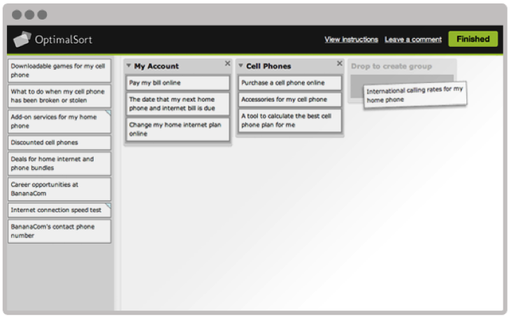
Card sorting is a technique that can help gain insights into how your users think about the organization of your content. This user research method can be performed using an online tool or in-person using physical cards.
The benefits of online card sorting.
Online card sorting has become a very convenient and common way to collect this information from users. The benefits of online card sorting include:
Fast and easy data collection – participants can log into a website and perform the activity at their convenience.
Large sample size – it is easy to obtain a large sample size for statistical analysis.
“Image provided by Optimal Workshop (www.optimalworkshop.com/optimalsort)”
Online card sorting has become the predominant way for user researchers to collect this type of data, but it can’t tell you everything you need to know about how to design an intuitive information architecture.
Online card sorting tells you what, but not why.
Collecting data on how your users sort items into categories tells you what they did, but not why they did it. The reality is that designing an information architecture is a messy job, and card sorting can sometimes lead to inconclusive results, especially if the items are particularly challenging for participants to sort.
Qualitative survey questions at the end of an online card are useful, but can’t really help you to get a full understanding of the user’s mental model. There is no way to probe deeper, and participants often give minimal responses to these questions.
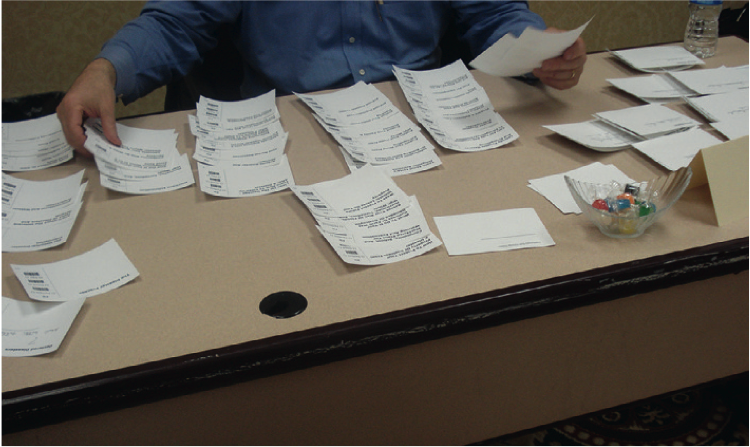
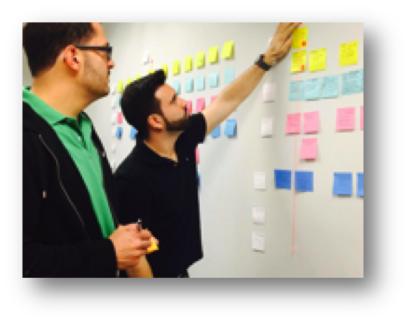
Gaining deeper insights with moderated in-person card sorting.
Moderated in-person card sort sessions are typically scheduled for an hour and are conducted one-on-one with a facilitator. Participants are provided with physical materials that include cards labeled with the name of each item to be sorted, pens or markers for making notes, and sometimes color-coded stickers for further annotations.
“Image from chapter 6, Information Architecture & Web Navigation, Eye Tracking in User Experience Design.”
The ability to manipulate physical cards provides many benefits to the participants including:
Easier to complete – physically sorting cards into groups requires less instruction compared with learning how to use a new online tool.
More flexibility – participants can put aside cards on a table and spread out as much as they need. They can write on the cards, cross things out, make suggestions, and draw out connections between cards, including cross-linking.
Higher engagement – participants tend to be more engaged when they are physically moving cards around. They are also less likely to be distracted compared with performing the activity remotely on their own.
The ability to sit with a participant as they sort cards provides many benefits to the researcher including:
Understand participant’s thought process – think-aloud protocol can be used to have the participant explain why they are sorting cards in a certain way.
Observe nonverbal responses – do they appear confused or frustrated? Do they visibly hesitate to place a card or create a label for a category?
Provide motivation – card sorting is a laborious and mentally demanding task. Participants often lose motivation to complete the activity. The facilitator can provide encouragement to the participant to keep going.
Moderated in-person card sorting is more time-consuming both in data collection and analysis than online studies. However, tools are available to reduce the time needed to analyze data.
Bar code scanner – bar codes can be used to tag each card and can then be scanned into a computer.
Utilize software tools – the same analysis tools can often be used to analyze the results from an in-person card sort.
Combining the best of both methods.
A hybrid approach that includes online and offline card sort activities will provide a more holistic understanding of how your users envision an information architecture. In this approach, it is recommended to start with an online open card sort study to see general trends in how users sort items. Next, follow up with an in-person study with a smaller sample size to understand a participants’ thought process including insights into how they would use the content.
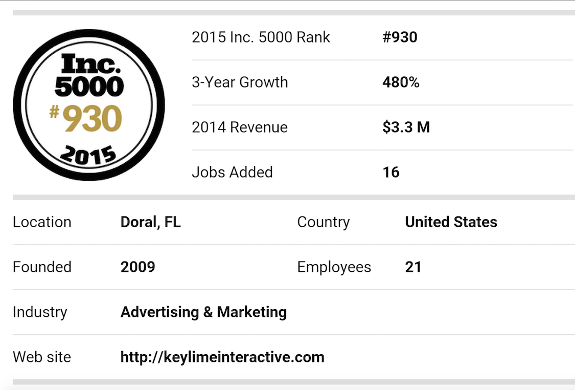
Inc. magazine ranked Key Lime Interactive NO. 930 on its 34th annual Inc. 5000, an exclusive ranking of the nation’s fastest-growing private companies. This positions them as the highest ranked usability firm. The list represents the most comprehensive look at the most important segment of the economy—America’s independent entrepreneurs.
“Since the day I opened the doors at Key Lime Interactive I’ve leaned on Inc.com as a source of inspiration.” notes Ania Rodriguez, founder and CEO. “We as an organization can feel our growth with each new client engagement; being ranked as part of this years Inc. 5000 validates that the mechanisms we’ve been working hard to put in place to keep pace will scale well as we continue to grow.”
Key Lime Interactive will also be named one of South Florida’s 50 Fastest Growing Companies by South Florida Business Journal in their 2015 Fast 50 Awards on August 20, 2015 in Miami, FL.
The 2015 Inc. 5000, unveiled online at Inc.com and with the top 500 companies featured in the September issue of Inc. (available on newsstands August 18 to September 22) is the most competitive crop in the list’s history. The average company on the list achieved a mind-boggling three-year growth of 490%. The Inc. 5000’s aggregate revenue is $205 billion, generating 647,000 jobs over the past three years. Complete results of the Inc. 5000, including company profiles and
an interactive database that can be sorted by industry, region, and other criteria, can be found at www.inc.com/inc5000.
“The story of this year’s Inc. 5000 is the story of great leadership. In an incredibly competitive business landscape, it takes something extraordinary to take your company to the top,” says Inc. President and Editor-In-Chief Eric Schurenberg. “You have to remember that the average company on the Inc. 5000 grew nearly six-fold since 2012. Business owners don’t achieve that kind of success by accident.”
“Key Lime Interactive is both honored and motivated by such recognition” says Jennifer Knodler, SVP. “We didn’t quite start in a garage like some of the other stories, because our earliest clients were F500 companies, but we started small and kept quality and research integrity front and center. I’m smiling because it seems to be working.”
The Apple Watch, released this past Spring, has caused companies to pay close attention to the quickly evolving wearable space. Consumers are looking to see if there is a tipping point for widespread adoption in the near future and they’re interested in staying ahead of it; preparing apps that are especially suited for Apple Store or Android Wear.
About a month ago I unpacked a lime green Apple Watch, paired it with my iPhone and wore it around town. In true researcher form, I found myself paying close attention to every new feature and announcing to my colleagues which features impressed me, and which failed me.
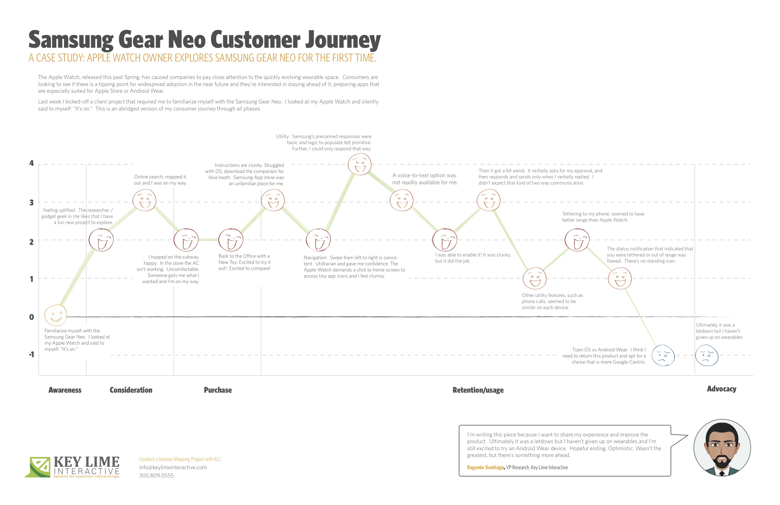
Last week I kicked-off a client project that required me to familiarize myself with the Samsung Gear Neo. I looked at my Apple Watch and silently said to myself: “It’s on.”
I should mention, I’m not an original member of the Apple Fanclub. I stuck to my Samsung Android mobile device for many years as the Apple products evolved. Eventually, I moved to Apple, mostly so that I could keep up on the current offering as much of my project work at KLI demands this. I looked at the Samsung Gear Neo with a wide open mind. I was excited to learn more.
The abridged version of my consumer journey is detailed here, including these typical phases of a consumer journey:
– Awareness
– Consideration
– Purchase
– Retention/Usage
– Advocacy
Awareness:
Last week I kicked-off a client project that required me to familiarize myself with the Samsung Gear Neo. I looked at my Apple Watch and silently said to myself: “It’s on.”
Consideration: Product Research & Purchase
+ 2 Feeling uplifted. The researcher / gadget geek in me likes that I have a fun new project to explore.
+ 1 I took a look on online, CNET.com, the Samsung website, confirmed that particular apps were available and I mapped out the nearest location where these are sold and I was on my way.
Purchase:
– 1 Travel to the store, beautiful outside but quite hot, I hopped on the subway, happy. I walked into the store and the AC wasn’t working, It was stuffy and uncomfortable, overall it sucked. Someone helped me out, got me what I wanted and I was done and on my way.
Back to the Office with a New Toy
+2 Excited to try it out! Excited to compare!
Retention/Usage:
– 1 I open it up and the instructions are clunky. I struggled with the Tizen OS, the pairing options were not straight forward. After re-reading the instructions I recognized that I needed a specific URL to download a companion for blue tooth communication. When I arrived at the Samsung App store, an unfamiliar place for me, I felt I had to fend for myself. No one was waiting to welcome me and show me around, per se.
+ 2 Navigation: Typically, on the mobile experience, you swipe from left to right to move ahead in a variety of different scenarios. On the Samsung Gear, this is consistent. It was intuitive and clear. Utilitarian and gave me confidence in navigating through. The Apple Watch, by comparison, demands that you click to return to the home screen and access app icons in a rhombus shaped cloud, they’re tiny, and I feel clumsy. I liked what I was seeing on the Neo.
Usage:
– 1 Utility: I first took a look at messaging as our first example. Apple executes this well. They have pre-canned text responses that seem to make sense and fit my standard vernacular. They were smart responses to the incoming message. Samsung had this too, but in my anecdotal experience the responses were basic and the associated logic to populate them felt more primitive. Further, I could only respond via precanned text.
– 1 A voice-to-text option was not readily available for me. I eventually found it, after going to my phone to set this up, check through T&C’s, and activating it for use on my watch.
+ 1 I was thankful for that. It was clunky, but it did the job.
-2 Then it got a bit weird. On my Apple Watch I was able to speak my text, review it, and push a button to send the message. On the Samsung I realized that once I was in a scenario where I was using voice-to-text, this was my only option. I’d speak my message, then the system would recognize that I would finish speaking my message and it would cycle through to a screen where I would be prompted to approve of the message. It verbally asks for my approval, and then responds and sends only when I verbally replied. I found it to be a bit uncomfortable that the watch was talking to me during instances when I didn’t expect that kind of two-way communication.
0 Other utility features, such as the acceptance of an incoming phone call, for example, seemed to be similar on each device.
+1 Wearing it for a longer period: Tethering to my phone: I will say that without running a full technical analysis, it seemed to me that the Samsung watch seemed to have better range, so that was a positive.
-1: However, the status notification that indicated that you were tethered or out of range was flawed. Samsung notified me that I was no longer connected, but after that point in time identified no icon or indicator that I was disconnected. If I missed the notification prompt I may not have known that I needed to reconnect or get closer until I actively attempted an activity. Apple has a standing icon.
-2: The Samsung Gear was released in spring 2014. Shortly after the Android Wear release was made for select hardware devices, not including the Neo, it continued to run on the Tizen OS. I think I need to return this product and opt for a choice that is more Google-Centric. I’d liked to have explored a more seamless experience, the “cue card”, full integration with my mail, and more.
Advocacy:
I’m writing this piece because I want to share my experience and improve the product. Ultimately it was a letdown, but I haven’t given up on wearables and I’m still excited to try an Android Wear device. Hopeful ending. Optimistic. Wasn’t the greatest, but there’s something more ahead.
Customer journey mapping is the visual or graphical interpretation of a customer’s story. Journey maps diagram a customer’s point of view, reasons, and emotions behind the interactions they have with an organization. Journey maps provide companies with a holistic understanding of their customer’s experiences over time and across different channels.
While many organizations and companies have their own way of journey mapping, all successful journey maps tend to share several familiar attributes. A successful customer journey map captures the various stages of the customer experience with a company, and the emotional responses the experience generates. It also identifies potential gaps between what customers need, or expect from a business, and what a company provides.
Why utilize customer journey maps? Well, there are several major benefits to building customer journey maps. Journey maps serve as a great complement to standard research, as routine corporate data often fails to communicate the frustrations and experiences of customers. Additionally, a customer journey map puts the user front and center in the organization’s thinking, which encourages people across the organization to truly consider the user’s feelings, questions and needs.
How do you get started with customer journey mapping? This can be a tough question to answer for any organization, as many journey maps, and the process of building them, can seem very complex and quite a lengthy process. However, there are some key foundational rules to follow when getting started with customer journey mapping. Following these rules will put you on the right path to creating great journey maps that help you gain valuable insight about your customers.
Recently, we conducted a customer journey mapping workshop in Miami, FL where we outlined some key tips for getting started with customer journey mapping. Below are some examples of the tips we provided during the workshop, and continue to provide to companies to assist them in getting started with customer journey mapping.
Five Tips for Getting Started with Customer Journey Mapping
1. Mine existing research to have a clear persona/customer target defined before you start building your journey map.
2. Outline the major touch points.
3. Be specific when describing interactions.
4. Limit the number of stages the customer has to go through.
5. Pinpoint what your company wants the user to DO, rather than what the user actually does.
Mine existing research to have a clear persona/customer target defined before you start building your journey map. Prior to building your journey map, you should utilize existing research data to pinpoint what target customer or segment you are going to be focusing on in your journey map. Use demographic, ethnographic, and other data from previous research to decide on a target customer you will be focusing on as you build your journey map.
Outline the major touch points. Outlining major touch points is the process of defining the major points of interaction a customer has with a business and the service(s) that business is offering. For example, if a coffee shop was defining the major touch points its customers go through when buying a cup of coffee; customer decides to go get a cup of coffee, customer drives to the coffee shop, customer waits in line at the coffee shop, customer places their order at the register, customer pays for their coffee with a credit card, etc. By outlining the major touch points a customer goes through, companies can gain insight into not only those touch points, but also the transitions the customer goes through between touch points. Defining the transitions between touch points can help businesses to see where customers may be dealing with certain issues or frustrations, at which point an organization can develop ways to remedy those issues to improve the customer experience.
Be specific when describing interactions. Specificity when describing customer interactions is crucial, as it helps to view the customer journey in its entirety, making it easier to distinguish between major and minor touch points. This gives businesses the ability to see if it is falling short at a critical touch point in the customer’s journey, thus opening up a grand opportunity to improve that point in the process and improve the overall customer experience.
Limit the number of stages the customer has to go through. Customer journey mapping provides businesses with a holistic view of the customer journey, which allows businesses to see if there are steps throughout the journey that could be refined or even eliminated entirely in order to improve the customer experience.
Pinpoint what your company wants the user to DO, rather than what the user actually does. When customers go through the process of purchasing something, the major touch points they often go through are stages such as Inquiry, Comparison, Purchase, Installation, and Post-Purchase Evaluation. Over time the customer journey can change and/or become altered as a result of many different factors. However, customer journey mapping allows businesses to identify these changes and monitor them to make sure they are not impacting the customer experience in a negative way. Businesses have the ability to take appropriate actions when needed to make sure customers are not going through unnecessary steps throughout the experience. This allows businesses to shape the experience and customize it for their customers, ensuring their customer’s experiences are as seamless as possible.
Honing in on the aforementioned tips and the key foundational aspects of customer journey mapping will put your organization on the right path to understanding your customers and their experiences more intimately. Utilizing customer journey maps will help your organization to better understand the key actions and motivators of your customers as they interact with your business and its products and services. Equipped with this knowledge, you’ll be able to identify your strengths and weaknesses, and subsequently reveal the primary areas where opportunities for growth and prosperity exist.