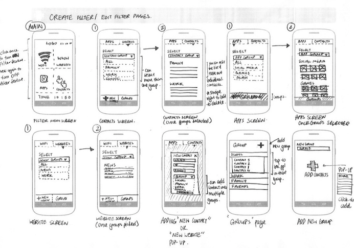
Looking for a cutting-edge, quick and easy way to get your designs from concept to interactive prototype? Working in an agile design environment and need insight into the usability of your concept prior to wireframing? If you answered yes to either of these questions, the POP (Prototyping on Paper) is a design methodology and app you’ll want to check out.
Paper prototypes are not a new or novel concept to the IxD Designer; however, adding interactivity to these paper prototypes is rather new. Enter an amazing app POP. I discovered POP when I was designing a niche market yellow pages app for iOS with a fellow designer at a design bootcamp. We needed a quick, down and dirty way, to test the interactions of our interface. We wanted to validate our design decisions quickly prior to designing the wireframes. A fellow student introduced us to POP.
Using POP is simple. You download the app on your iOS, Android, or Windows mobile phone and start snapping photos of your drawing comps. You can then either work on a desktop/laptop or directly on your mobile phone adding ‘hotspots’ by drawing and dragging active areas and defining what action those hotspots should execute. Link pages together by assigning actions to these hotspots and build a functioning paper prototype of your app in minutes.
Take your concept one step further by using the built-in sharing function of POP. We decided to do some guerilla testing of our initial navigation structure and used the sharing function of POP to share our prototype with friends. We also used Key Lime’s mobile testing tool KLUE to record the interactions and video of the user while interacting with our product. These initial findings helped us tweak our design prior to building and testing wireframes.
Another great feature of POP is the ability to sync with Dropbox and integrate easily into your workflow. Drop photos of your pencil sketches into Dropbox and they immediately appear in POP’s app. Have photos from others working on the same app, share your Dropbox folder and have everyone drop their photos into Dropbox for immediate access to screens from all your team members.
POP is a great app for anyone who needs to quickly gain insight into their designs- heck they even have free downloadable sketch templates for all kinds of mobile devices! Have questions about prototyping on paper, or UX & IxD design in general? Reach out to me- troy@keylimeinteractive.com (UX Research Manager at Key Lime Interactive).
Their theme: Make it a priority to plan ahead AND be culturally sensitive/aware.
Infinite perspectives are available around the globe, spanning multiple languages, habits, patterns, cultural priorities, etiquette and more. The requirement to meet the needs of a diverse audience is clear, and with that comes diversity of your recruited panel. In a recent study that spanned four continents, Key Lime’s Eugenio Santiago, VP of User Research, noticed that the stakeholders in the research weren’t aware of the relevant needs of each country when they outlined their vision of a successful project. “That’s my job.” Eugenio stated. “I have to make sure that all of the nuances that organically associate with a culture are considered from the early stages of research design. I need to rely on strong in-country partnerships to bring the surface any minute detail that I may have overlooked.”
Key Lime leverages their UX Fellows global partnership for this. With a mission to make “international user experience and usability testing as easy and professional as domestic studies,” there are checklists in place to ensure success. Simple things ranging from proper power requirements, to considering the time of day you’re asking users to test, to understanding pace punctuality; customary greetings are all to be part of a successful testing experience.
Other panelists stressed the importance of building in time for debriefs and dialogue with all parties involved solidifies strong findings and reporting. The in-country perspective is invaluable when reporting user satisfaction.
When speaking with the audience, it was clear that international work was on the rise. Much of the feedback was that folks were already testing in a global setting, or in the process of preparing themselves for this leap. They happily walked away with what was the start of their own actionable checklist of considerations to be successful testing around the world. A few points to get you started as you build your own list:
Consider Cultural Elements:
This goes beyond language. Customary greetings, pace, punctuality, and etiquette should be considered. For example: One panelist reported that during their first global foray they planned to field a study that investigated the way users interacted with a product in their homes in India. They created a study plan that included six thirty-minute home visits in a day, and presented it to their Indian Research Partner. He took one look and said “Oh no. Not possible.” Why? Because traffic wasn’t being considered. It was assumed that 50% of the day would be spent getting around, so three in a day was pushing it. Adjustments were made in advance vs. sweating it out; rearranging on the fly and failing to meet the schedule.
Consider Technological Capabilities and Be Prepared:
“You may run this exact study 355 days a year in NYC, but when you endeavor to replicate in a different country outside of the US on that one day, you can’t take the ‘little things’ for granted”, says Santiago. Wifi, power, keyboard setup, and a host of other things need to be considered. To overcome unforeseen challenges, the panelists advise to stay on the side of caution. “Backup web connectivity options if the facility can’t provide what you need.” Of course, there are times when that connectivity needs to be considered as PART of the test, but we need to do our best as researchers to isolate the technological variable to best influence design.”
Have a Contingency Plan:
Eugene opened with a funny story about an awkward time when he experienced an in-country moderator and a client bang heads mid study. “My observation, even as a non-native speaker, was that these two had opposing viewpoints of the way this research was to go down, and they were making it known. By the end of the day I had to make significant changes to satisfy the client.” He had done his homework and let two other facilities and two other moderators know that Key Lime was in town testing, and that he may need their help if he runs into a pickle. That simple notification gave him an option to make a moderator change for the remainder of the study.
“Aha moment tips for global studies. Don’t forget your international power converters.”
“Schedule downtime to research when fielding for long 2-week periods.”
“Eugenio shares the importance of multi-tasking and using our partnership with @UX Fellows for global reach.”
“@Google is experimenting with a new approach to shorten the study time since stakeholders want answers now.”
“@eBay speaking about importance of translation and the challenge of emotional measures.”
More from the panel:
Anosha Shokrpour Groupon @anoshas
With 5+ years of experience in the field at eBay Inc. for most of her tenure and now at Groupon, Anosha has a deep understanding of the international e-commerce landscape that spans across developed and emerging markets.
Donna Tedesco
eBay Inc.
Donna Tedesco is a Senior User Experience Researcher at eBay Inc. She has experience using moderated and unmoderated studies for global research while working for in-house research teams over the last 13 years.
Chelsey Glasson Google
Chelsey is a user experience researcher whose skills have impacted a wide variety of enterprise and consumer technologies at diverse companies including Google, Salesforce, Udacity and T-mobile. Motivated to help others avoid her early UX career mistakes, she often writes and gives talks on the topic of UX Careers.
Sin Lee Loh
eBay Inc.
Sin Lee Loh is a user experience researcher at eBay, currently focused on buyer experiences but previously focused on conducting research in Latin America and Russia. Sin most recently conducted ethnographic research in Brazil.
Eugenio Santiago Key Lime Interactive
Eugenio Santiago is a ninja in user experience research helping the world’s most admired brands optimize their digital and product experiences. As Vice President of User Research, he manages the team of both qualitative and quantitative researchers. Eugenio has been recognized by clients for his ability to quickly spot patterns and provide actionable recommendations. Most recently, Eugenio’s focus has been in the areas of Mobile, Finance, and Retail while still maintaining a passion for sports and gaming.
It’s been a few years now, but I recall distinctly when the transition to mobile in the travel industry happened. I was in the midst of traveling often for business and I said to Sidra Michon, Product Usability Manager at KAYAK, that I felt like I needed to sort hotels by “Free access to print your boarding pass”. She chuckled at how real my problem was. A few months later, Brian Sullivan, then at Sabre, suggested to me that I wouldn’t need anything but my phone (my shiny new iPhone, that was) in the coming months.
Then, it was a domino effect. I could book my flight, complete a purchase for my luggage, use my phone as a boarding pass, book a hotel, check in, aggregate my travel itinerary, order takeout to my hotel room, hail a cab, use Wi-Fi on the flight and in the airport, map my route, even if walking in NYC. I could dictate emails while in transit, listen to webinars via conferencing software, check the CRM system for updates, get notified about travel changes and delays. The single most powerful tool that I had available was my smartphone. I didn’t need a wallet, a computer or a pen.
Today’s travelers are exactly as Moxie describes: “Tethered, Tolerant and Talking vs. Mobile, Multitasking and Messaging”. They need to be reached in different ways. Dana Bishop, primary report analyst and Director of Quantitative Research, was awed by the mad scramble of traditional travel companies to throw their hat in the “last minute arena”, as she puts it. It seemed that this Mobile, Multitasking and Messaging culture wants instant, satisfying and simple, too.
As a result, the Competitive Report Division of KLI, run by Bishop, recently announced a new report in our Competitive Index portfolio that focuses on overall functionality and experiences offered by today’s last minute hotel booking apps. Titled Last-Minute Hotel Booking Mobile Competitive Index Report, KLI reviews sixteen (16) apps including those designed specifically for booking last-minute travel as well as the top OTAs in the U.S.
This is more than an industry standard travel technology survey. KLI asks users traditional questions about their current behavior to understand trends, but they push to learn about the innovation that consumers are buzzing about, what they expect to see next, what barriers to a perfect experience exist.
“With many players in direct competition to secure a place to rest your head while traveling, the indecision about which booking agent or OTA to use can be paralyzing to the user.” says Phillip McGuinness, report contributor. “As with all of our reports, we survey the target audience to see what they need and want in terms of features and capabilities first. Then, we take those desires into consideration when comparing and ranking the apps, giving more weight to consumer’s top priorities.”
The review examines their iPhone and Android apps (where applicable) and ultimately ranks the apps, awarding top rank to those who most effectively meet the consumer’s self-defined need.
Buyers receive a detailed report that identifies the survey results and the associated ranking of the 16 apps. They also benefit from detailed best-in-class features including screen prints and expert analysis. Opportunities for improvement are discussed as well as a new trends and innovation section where new concepts such as the use of an app to open hotel room doors or a mobile chat feature to communicate with hotel staff are highlighted.
“Differentiation such as the ability to set style preferences, access customer reviews, set filters, as well as view saved search history and favorites become apparent. Better, the impact that these features have on the user experience or the ability to meet user preferences is identified.” states Bishop. “Organizations crave both a way keep pace with what consumers want as they build their roadmap while also tracking and scoring themselves against the competition; to have a baseline that they want to beat as they continue to evolve. This offers them just that.”
Read the full press release here.
To purchase the published report, please reach out to Key Lime Interactive for more information here.
The Gaming Analytics Summit held in San Francisco brought together a nice crowd of headliner video games such as Minecraft, Call of Duty, Destiny, Angry Birds, and Candy Crush. In attendance were the big gaming giants such as Sony PlayStation, Xbox, Activision, and Electronic Arts. Being an avid gamer and data analyst made this conference extremely informative. The topics ranged from in-game analytics to building a company structure that best handles big data. My focus at this conference was to see how the user’s voice was being heard in the video game development pipeline. Qualitative interviews meant very little to this group who focus more on big data and analytics, but some companies set themselves apart by emphasizing the importance of the user in maximizing their earning potential.
With so much data available from in-game selections, purchases, and behaviors; capturing and analyzing data in such volume has to be highly efficient, lightweight, and funneled into a visualization that is simple enough to consume and draw conclusions. Sega’s entire presentation was about the importance of simplicity and consistency in analysis and visualizations. It clearly demonstrated the challenges of presenting huge bar graphs in reports that are difficult to digest. Following Sega’s presentation, I noticed a theme: Big Data, Big Results, Now What? Attention was placed on displaying data, but not on determining the next course of action.
Candy Crush’s presentation also grabbed my attention. The presenter offered one listener a choice between a mobile power pack and a Rubix cube. The listener chose the Rubix and the speaker said, “now that we know what he chose we can determine some things.” I spoke up during Q&A. “My question throughout the presentation was ‘Why did he choose the Rubix? Doesn’t understanding ‘why’ make your content delivery algorithms more relevant?” He was a bit perplexed and said they just try to do their best to analyze the data they have to learn about users. I responded, “Wouldn’t it be easier just to ask?” It seemed that there was little attention paid towards why users behave the way they do. All focus was placed on A/B testing to determine the best conversion rates. While this method may work, it also presented a very wasteful practice of blind A/B testing.
Just when I thought the user was being completely left out, Alex Leavitt from Sony PlayStation emphasized the importance of User Research in his presentation. He mentioned that his focus was on “Game Science”, which is comprised of game analytics, user research, and gaming design. He continued that integrating user research data into the design process is critical to challenging developers’ design intuitions. The slides shown in the picture demonstrate the need for user research to be experience focused, data informed, and player driven; but also that it should be interwoven into the entire development cycle.
The smoking gun to tie everything back came in a case study of Angry Birds development company, Rovio. This study focused on re-activating gamers that have not been playing as frequently. More activity means more chances they will pay for something in-game. The solution was relevant content. Behavioral patterns, feedback, and ratings were used to better personalize the in-game rewards and messaging, which significantly improved conversion rates and reactivation. Minecraft followed suit by emphasizing the importance of building gamer personas to better understand users. The use of gamer personas by Minecraft demonstrated a big data trend for personalization. Personas may not give the details of every type of user, but it does create a personal connection to a type of users that may be a large portion of your customers. Personas can help narrow the gap between advertising and intrusion. Knowing the needs of the gamer and serving them relevant content or preferred in-game rewards makes a game more addicting and more profitable.
I received my Apple Watch this past Thursday. I chose the space grey Apple Watch sport with the black band, which was worth the wait. It’s fairly subtle, with one person (okay, a kid!) thinking it could be a real watch. Overall, I am impressed with its performance, especially for a v1 device with limited connectivity options. Powered by my iPhone 6, even on LTE instead of wireless, there is very little lag in most apps. However, the remote app has some issues connecting to iTunes libraries. It’s fantastic as a remote for the Apple TV, but very limited and challenging to sync with my computer’s iTunes library.
Performance at home is fantastic. I was able to leave my phone in my bedroom and wander all over my apartment with the watch. I made calls on it of durations between 30 and 40 minutes with no problems. I will say the speakers could be a bit stronger, though. It’s hard to hear people if they’re speaking quietly, or also on speakerphone. Messages and alerts come through in real-time, though. Pleasantly, if you’re interacting with an app on another device you do not receive an alert on the watch. While this makes sense, it isn’t true for the iPhone/iPad, so it was a great software addition that should come to more devices in the family.
I was deeply impressed with its performance in transit. Using Bluetooth, the watch is still connected to your phone so you can change music or get activity updates while underground with no cell service. Where there is cell service, it will push notifications to you. I was expecting the watch to be fairly useless while traveling, but that is certainly not the case.
It’s useful while at work. Again, the performance over LTE has few noticeable lags for any app, apart from maybe 5-10 seconds sometimes for NYT updates. The calendar alerts are fantastic. They pop up 10 minutes before your meeting and let you scroll through all of the meeting details. There’s even an option to email the meeting creator, which is the only email option I’ve seen on the watch so far. The dictation is good enough that I wish they allowed text responses to emails. It would be a really useful update. My biggest frustration while using it at work was when I went out of range for a meeting in a far conference room. I didn’t bring along my phone because the watch was a great substitute, but it didn’t alert me as I was exiting its range. Some sort of notification would be helpful, as it’s challenging to gauge distances, especially inside buildings.
The messages app is delightful to use. Being able to dictate messages makes it extremely functional. However, the feature could be improved by making it easier to edit these messages. I’ve definitely found myself canceling messages and re-dictating them due to one or two incorrect words in places that would make overall comprehension challenging. I would also like to be able to send the messages without having to touch the watch. There currently isn’t a verbal command that lets you send a message. Despite these usability challenges, I still found myself sending the majority of my text messages this weekend using the watch. It’s the easiest way to send text messages I’ve seen so far, though it would definitely be improved by easier (or any!) editing capabilities and a way to send without touching it.
Email is surprisingly functional on the watch. Initially, I assumed it would be just notifications, but you can scroll through the entire email. Not everything renders on the watch, especially graphics, but you can see the entirety of provided text, which is very useful. My biggest pain point when using the email feature was how difficult it was to delete emails. When I clicked on a notification, I had to scroll through the email to get to the delete option. In your mailbox you can swipe for a trash option, but as a notification that only gives you the option to clear notifications. Being able to delete from the notification without scrolling through the whole thing would be a useful addition.
My largest gripe centers around Apple Pay. Figuring out how to add a card to the watch was NOT intuitive. It kept directing me to my phone, but I assumed it was the regular Passbook section. I tried re-adding my card, but it didn’t let me. I had to Google how to do it to find out it was in the Apple Watch app on my phone. Even then, I had to re-verify my card for the watch by calling my credit card company. When I tried to use it at Whole Foods by tapping the button twice it kept telling me it was ready, but ultimately it was unable to make the payment. Obviously, this was pretty frustrating. I ended up using my phone. Seeing as the watch is likely one of Apple’s best chances at making Apple Pay catch on, it’s a shame this was the least intuitive watch experience I had all weekend. This experience should definitely be improved. The Apple Pay on-boarding would have been easier with a diagram clearly illustrating where to go on the phone. The BEST solution would be letting me choose on the watch whether to add the credit cards from my phone. I don’t see why I need to go through the phone. I’m not sure why it doesn’t work in stores, but that’s definitely a huge issue that needs to get fixed.
The native activity app is interesting. I’ve given it a small amount of information and it’s been making attempts to inspire me to greater efforts. I personally am not a super active person, but what I like about the activity app as it exists currently is that it works with you. It’s not being overly critical or alerting me too frequently, both of which would result in me turning it off. It’s sitting there in the background letting me know when I’ve hit a goal or reminding me when to stand up. I don’t listen to every stand reminder, but I’ve listened to more than I’ve ignored. I’m curious to see if it changes my behavior over time. It’s definitely a much better way to interact with this information than the Health app on the iPhone, which I’ve always found oddly buggy.
Of the 3rd party apps I’ve interacted with so far on the device, I’m most impressed with the New York Times app. They’ve done a wonderful job of creating a new kind of article specifically for the watch. Some articles feature just a headline, some have pictures, and some have 1-2 sentences. It’s a fun surprise to scroll through them a few times a day. I do hope in the future it’s possible to read full shorter articles on the device, but I understand their choice and think it makes a lot of sense for the watch that exists today. 95% of my interaction with the NYT iPhone app is through notifications, so NYT on the watch is an ideal match. Now I actually get more information with the brief articles and images. I prefer the tablet for actual reading, but again I would be interested in having a more email-like experience for the NYT.
While I was initially unimpressed with the battery life, it was fine over the weekend. It does drain my phone battery faster, BUT it means I’m spending significantly less time on my phone so that evens it out for the most part. Like all Apple devices, I would appreciate a longer battery life, but I will say it survives a 12-hour day much better than the iPhone. Having the two devices has made it possible to have weekend days without airplane mode or constant recharging. Speaking of charging, I wish it were possible to wear the watch while charging it. One of the best use cases for me so far has been using the watch to act as an Apple TV remote. I do most of my Apple TV watching at night, so it would be great to be able to plug it in and continue using it. I’m also curious about the watch’s potential as an alarm, given that the taptic feedback might be a more pleasant way to wake up.
At this stage, I would rate the Apple Watch as a ‘nice to have’. If you, like me, own the whole family of devices and upgrade pretty regularly, go for it. It’s an awesome addition to the family, and you’ll find a lot of unexpected uses for it. I think it needs to be able to stand alone, ideally by v2. However, it’s still challenging enough to use that I wouldn’t recommend it to my parents just yet. I do think it will get there, and I will definitely be keeping mine and not returning it. Its best uses for me are: messaging, Apple TV remote, email, and keeping me off my iPhone (supposedly the #1 secret purpose). Those are important enough things in my life that I find value in a device that improves my access to them.
Note to Apple: I would be happy to put a $5 data share plan on it so I could leave my phone behind while at conferences, meetings, bars, parties, etc.
In a recent collaboration with User Experience Magazine I published an article entitled: The Future of UX Research: Uncovering the True Emotions of Our Users. The motivation for writing this article was to expose the UX community to the possibilities of using biometric and neurometric measurements to understand the emotions of our users. Current methods for understanding a user’s emotional response are at best limited, and at worst, entirely inaccurate. As the field of user experience evolves, we need to explore new methods for measuring emotional responses using technologies borrowed and refined from neuroscience and human biology. I also wanted to highlight some of the latest technologies available to user researchers, as well as the challenges of working with these tools.
I was thrilled to receive so many positive comments about the article as well as many questions about using these tools. This recap provides some of the key aspects of using biometrics for user experience research as well as answers to the most frequently asked questions about the topic.
Here are some do’s and don’ts for using biometrics in your user experience research projects:
Do:
Hire specialists on your team with a neuroscience, cognition, or experimental psychology background (preferably a Ph.D.). They will be most helpful during the study design and also during the analysis of your biometric data.
Run lots of pilot tests. Incorporating biometrics can add unforeseen challenges to your study and requires extra practice to ensure that data is collected accurately with actual participants.
Ensure that you have a sufficient sample size. Biometric studies require more participants than a typical usability test to account for the potentially large variability between participants. You will also encounter more situations where data needs to be excluded because due to improper equipment calibration, equipment failures, etc.
Don’t:
Examine biometric data in a vacuum. It is important to triangulate data across a combination of different methods including nonverbal observations, participant retrospectives, surveys & rating scales.
Assume that your data is perfect. Measuring biological and neurological responses, especially with the tools accessible to UX researchers, is not going to be 100% accurate. I would recommend looking at general trends in valence (i.e. positive/negative spectrum of emotions) changes instead of trying to pinpoint exact moments where very specific emotions were felt.
Questions & Answers
There have been a variety of tweets and posts generated as a result of publishing this article. Here are some of the most common questions with my thoughts:
Do participants mind wearing all of that equipment? Does anyone complain about it being uncomfortable?
Before making any purchases, I heavily researched all of the existing hardware currently available to make sure that it was as minimally intrusive to participants as possible. In many cases we are only using one or two measurements at a time. I try to use only one measurement that requires physical contact with the participant, such as wearing a GSR wristband combined with facial analysis that only requires a webcam. At the end of a session I always ask the participant whether wearing any of the gear was uncomfortable for them or if it impacted their experience at all. Most said that once the session began they quickly forgot that they were wearing anything.
Is it [biometrics] worth it? Wouldn’t it just be easier to interview an individual or give them a survey to complete?
We are at the very beginning of an exciting journey to uncover more about how our users are actually feeling. Biometrics is definitely not for everyone, and it is not a useful endeavor for all situations. I actually don’t think that these tools are ready for mainstream UX researchers just yet. The tools and software continue to get better every day, and will likely become more useful to UX researchers within the next few years. However, for those who are very serious about obtaining objective, quantitative measurements about your user’s emotional journey, I would recommend trying out these tools to see if they are useful for your team.
I’m very interested in learning more about biometrics! How did you learn about this topic? Would you recommend any resources?
There really isn’t one place to find out everything you would want to know. Biometrics is still a very new topic for the UX community and most of the resources out there are geared for people in the fields of human biology and neuroscience. I started reading a lot of academic papers to understand how to collect and analyze the data. There are a few worthwhile articles in the ACM Digital Library that provide case studies where biometrics were used in the context of human-computer interaction. I would also recommend looking into each biometric and neurometric measurement (e.g. EEG, GSR, etc.) individually. You can get a basic sense of how these tools work by visiting the websites of the device hardware and software manufacturers. My article provides links to many of the major vendors who make UX researcher-friendly products.